Office Depot / Office Max
E-Commerce Modernization
Revenue wasn’t lost—it was hiding in the gaps of the purchase experience. We went after it.

+ $48M
Small changes at enterprise scale can create outsized value.
A 14-basis-point conversion lift and $2.34 AOV increase generated nearly $48M in annual revenue. The work focused on the high-friction moments behind those numbers: cart clarity, delivery decisions, coupon errors, rewards visibility, payment confidence, and checkout completion.
The Story
At Office Depot’s scale, experience friction was not a minor usability issue. It was a business issue. A confusing coupon. An unclear delivery option. A buried reward. A checkout step that asked too much, too late. Each moment created hesitation. And across millions of shopping sessions, hesitation had the potential to become lost revenue.
The Business Problem
Office Depot needed to improve the performance of its core digital commerce experience while operating within legacy technology constraints, complex fulfillment logic, coupon and rewards complexity, and evolving customer expectations shaped by modern retail leaders.
The work centered on four business goals:
Increase conversion
Reduce cart abandonment
Increase average order value
Improve retention
The design opportunity was to translate those goals into practical, visible changes across the customer journey.
My Role
I led design direction across the commerce experience, shaping the UX and visual approach for key transactional and shopping flows.
My contribution was not limited to oversight. I directed the experience strategy, guided the team’s design decisions, shaped the visual direction, and personally drove many of the
Design Challenge
How do you make a legacy commerce experience feel modern without pretending the constraints do not exist? We focused on the moments where users were most likely to pause, question, backtrack, or abandon:
Can I get this when I need it?
Is pickup, delivery, or shipping the better choice?
Did my coupon work?
Am I getting my rewards?
Why is checkout asking for this again?
Can I trust this total?
Am I ready to place the order?
Those questions shaped the work. The goal was to make each decision clearer, faster, and more confidence-building.
01
Design Challenge
How do you make a legacy commerce experience feel modern without pretending the constraints do not exist? We focused on the moments where users were most likely to pause, question, backtrack, or abandon:
Can I get this when I need it?
Is pickup, delivery, or shipping the better choice?
Did my coupon work?
Am I getting my rewards?
Why is checkout asking for this again?
Can I trust this total?
Am I ready to place the order?
Those questions shaped the work. The goal was to make each decision clearer, faster, and more confidence-building.



02
Design System
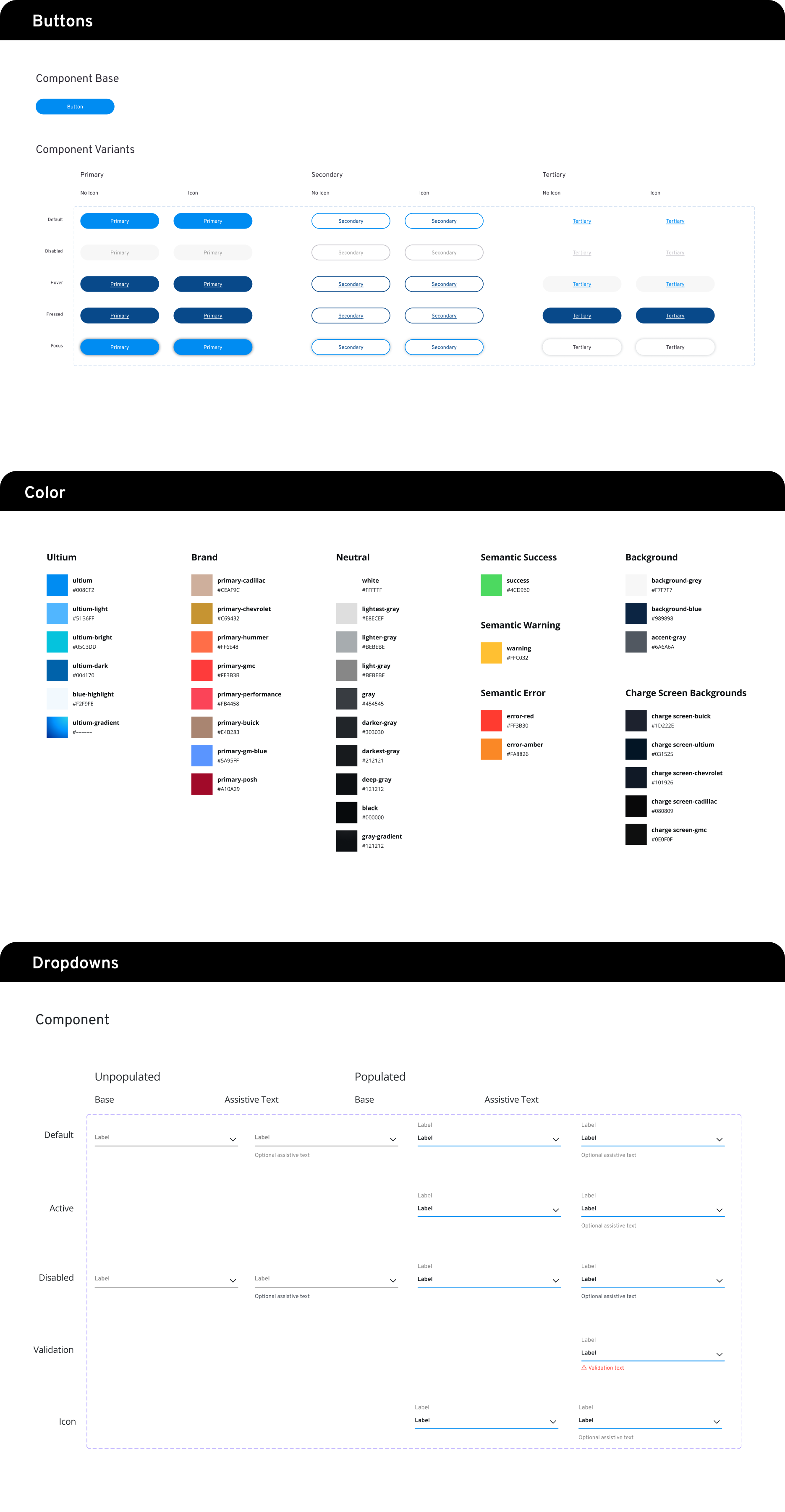
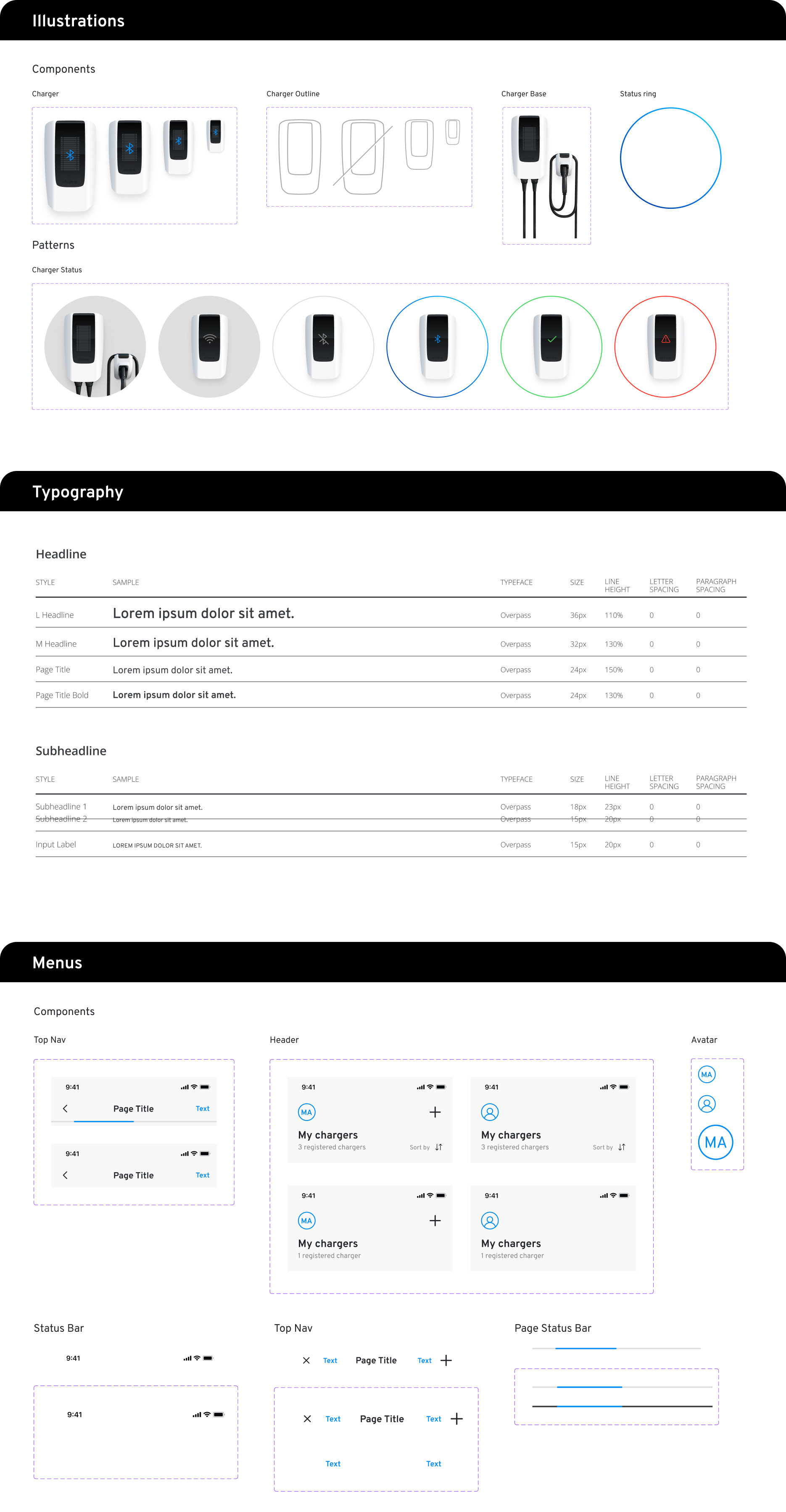
I designed and maintained the Ultium core design library in Figma. Each element was built leveraging Figma’s auto layout tool allowing for responsive design behavior in frames and in layout.
Components
Banners
Buttons
Dropdowns
Icons
Illustrations
Keyboards
Notifications
Progress Bar
Status Bar
Patterns
Brand Tiles
Charger Tiles
Dialogs
Lists
Menus
Snackbars
Tags
Foundation
Breakpoints
Breakpoint Grids
Color Palette
Elevation
Spacing & Grids
Typography
03
Interface Design
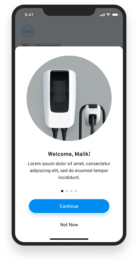
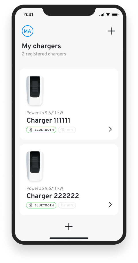
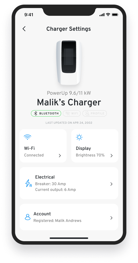
My goal was to define a delightfully intuitive visual design language that felt like an extension of the General Motors brand. Leveraging simplicity in form, color and pattern was key to styling an interface that would have universal appeal.
Below are a few key screens from the experience. Each design represents one of many screens designed for that feature. My approach for this UI was rooted in design fundamentals – the use of scale, color and negative space specifically.
Splash
Launcher
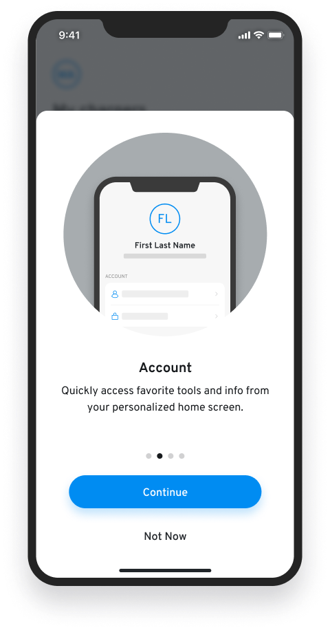
Onboarding
Loading States
Home States
Dashboard
Product Sorting
User Account
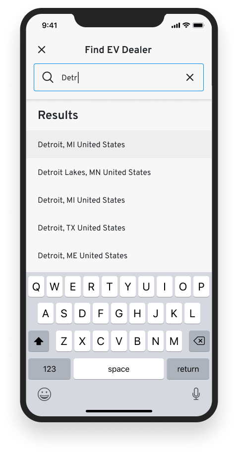
Locate a Dealer
Charger Setup
Authenticated Account
Guest Mode
1 / 4 Onboarding

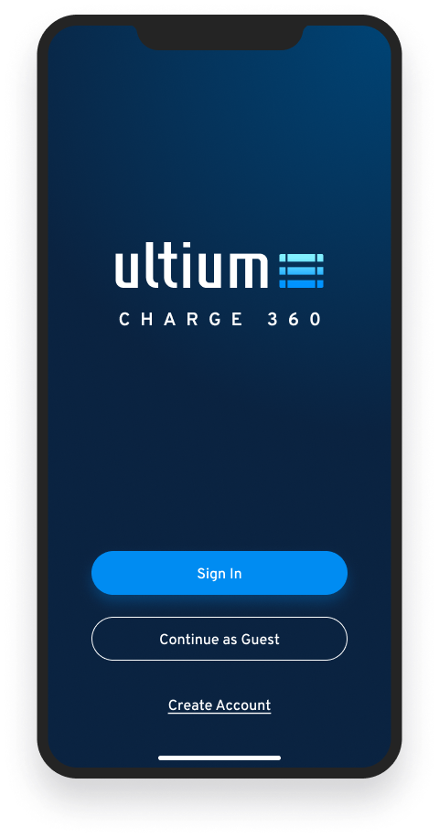
2 / 4 Home States



3 / 4 Charger Setup


4 / 4 Find a Dealer