Case Study
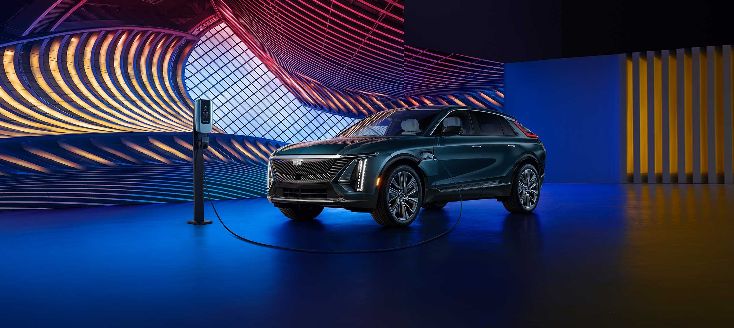
Ultium Charger
Designing a brand-centric interface for General Motors at-home EV charger.
Overview
The Ultium Charger is GM’s first at-home charging solution for their multi-branded electric vehicle lineup. I collaborated closely with engineering, interior display teams, brand stakeholders and product design. Transforming our unique set of challenges into solutions was the key to success.
My Role &
Responsibilities
Lead Visual Design
Figma Design Library
UX Design Support
Benchmarking
Iconography & Illustrations
Prototyping
User Testing Support
Executive Presentations
Brand Design
Motion Design Direction
Brand Design
Development Support

Key Takeaways
Cross-Enterprise Colaberation
We spearheaded a coordinated effort creating invaluable efficiencies; synched communication, systematic information sharing and imbedded team structure.
Transformative Impact
The success of our new team structure and cross-enterprise collaboration quickly became the new standard for ways of working in the CX Studio at GM.
01
Challenges
Limited CPU load, environment influences and a complicated EV ecosystem presented a handful of problems. We turned these hurdles into advantages by transforming our process for a more inclusive approach. The subsequent results helped define the final product and much of its design details.
-
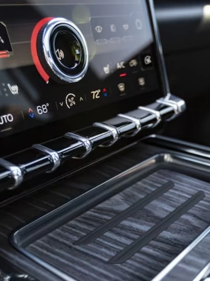
Challenge
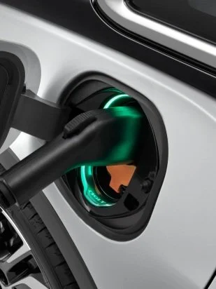
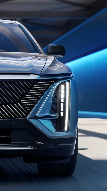
The footprint of our charge indicator graphics and their animation capabilities were extremely limited due to maxed out CPU loads during charging.
Solution
Strategic design of shape and motion were key. Leveraging the outer edges of the interface allowed for maximum visual impact with a very efficient footprint. Motion was limited to simple on/off states with unique sequential patterns for each charge state. Color and design detail helped to distinguish each brand’s interface. -
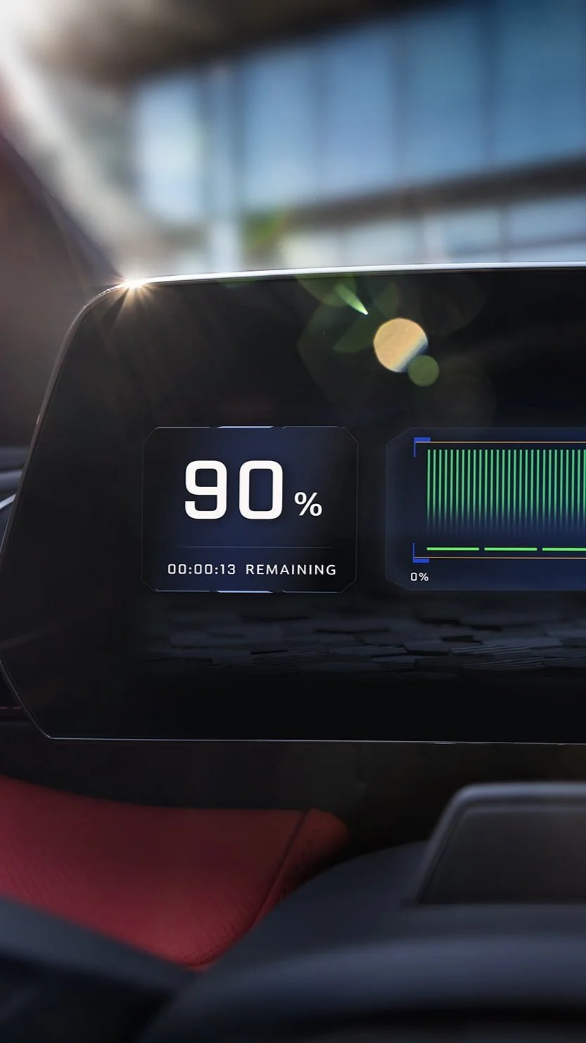
Challenge
The physical distance to our product and the potential for extreme environmental lighting posed a new set of accessibility needs.Solution
We consulted with multiple teams and resources to establish a set of guiding principles to meet these needs. We first increased the scale of the design by 25% across the board, especially with typography. We then increased the contrast by way of color and form. Last, we minimized the visual noise – keeping the design clean and intuitive for our users. -
Challenge
The charger experience is one moment a larger journey for our EV customer.Solution
It took a very well coordinated and multi-disciplined effort to design for this product. We worked with the teams listed here to help ensure that our experience was seamless in its design and implementation: In-Vehicle UX Team, Charge Port Team, Mobile Apps Team, Marketing Partners, Brand Stakeholders & Hardware Engineers.
02
Interface Design
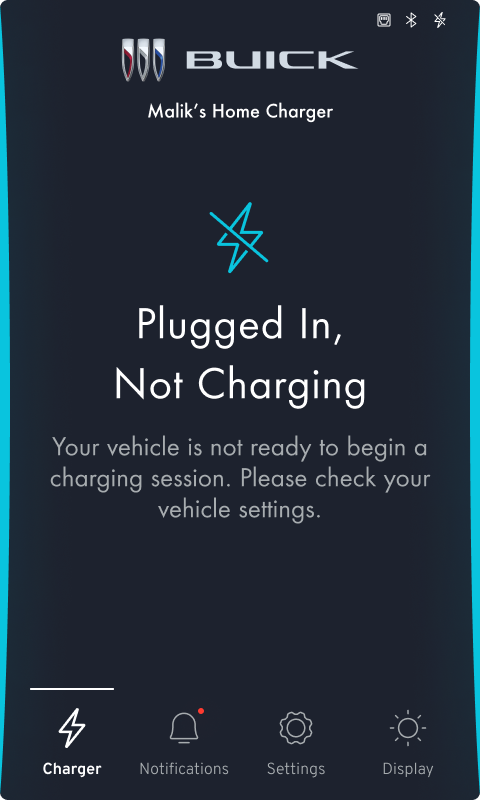
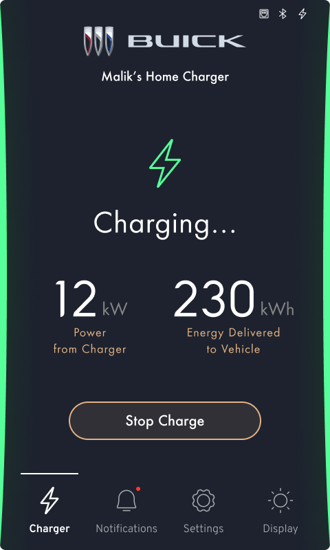
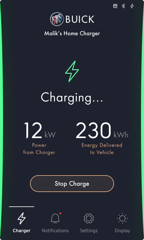
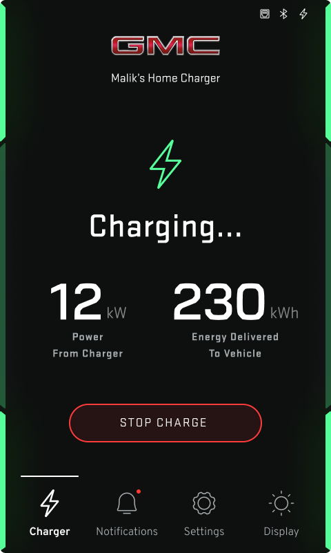
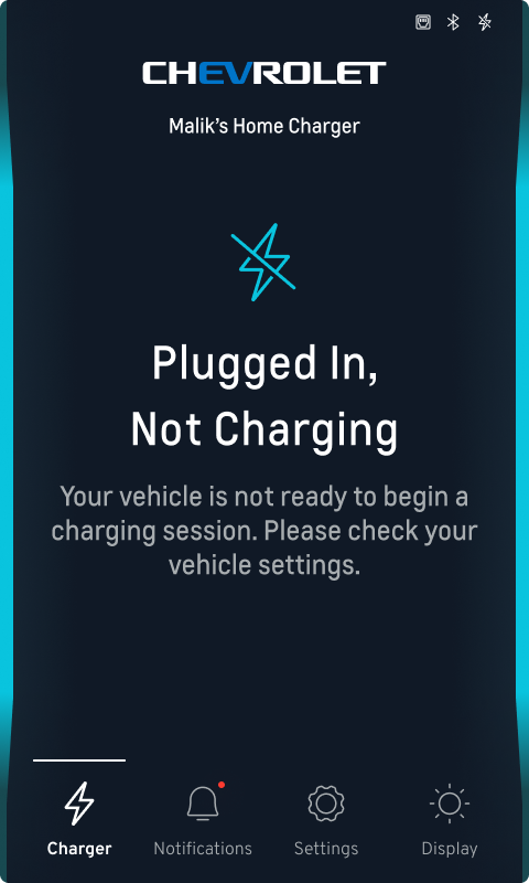
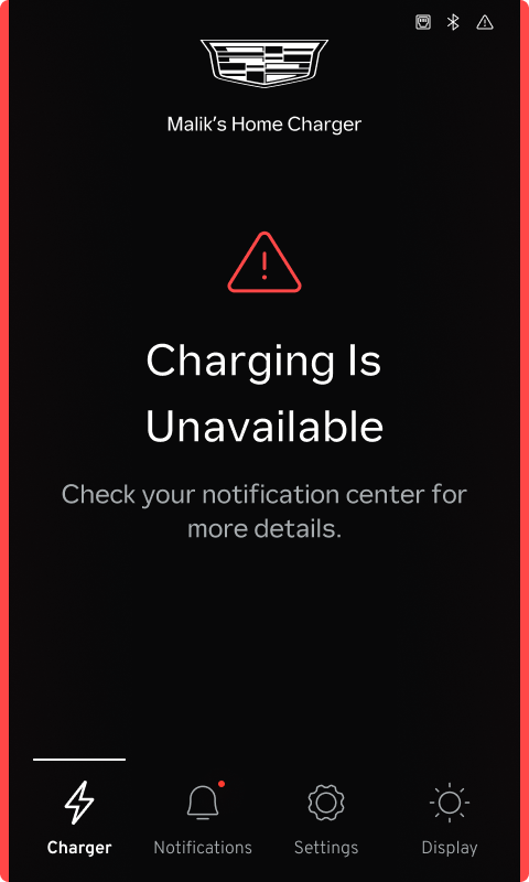
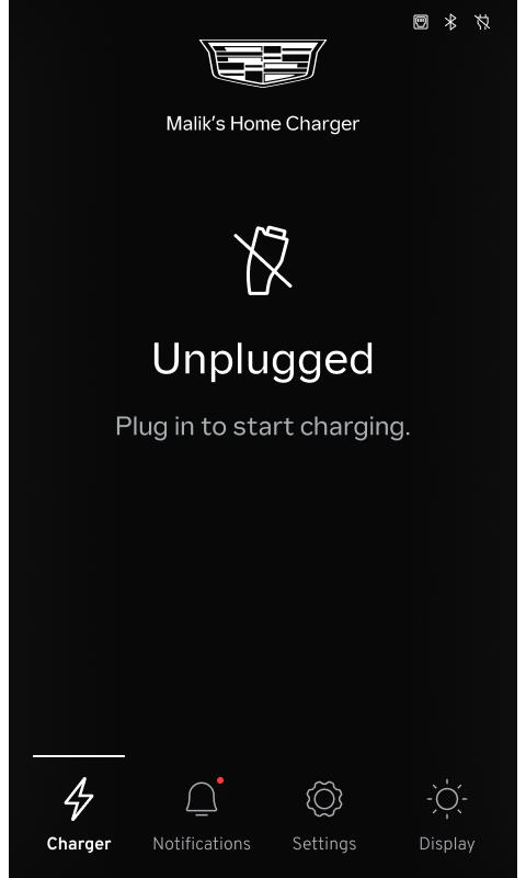
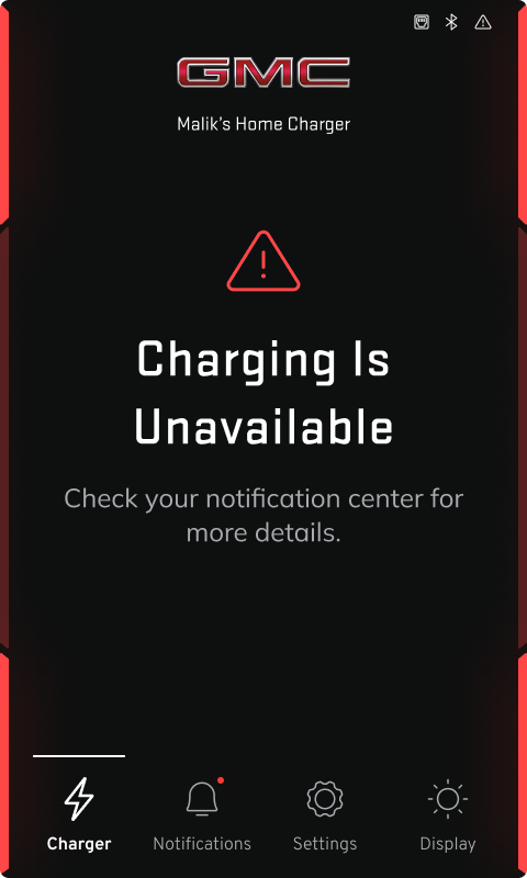
The customizable branded dashboard features the products primary functions – communicate vehicle charge status to the user and enable them to manage their charger through multiple product features. I leaned heavily on usability heuristics and design fundamentals throughout the process. Here are some noteworthy design details.
Minimalist Flat Design
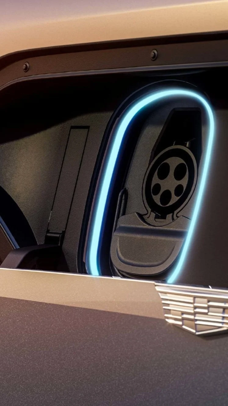
Unique Branded Charge Indicators
Systematic Design Solutions
Universal Navigation Dock
Iconography Design
Color Behavior Design
New Figma Style Library
Safety Critical Motion Design
Feature List
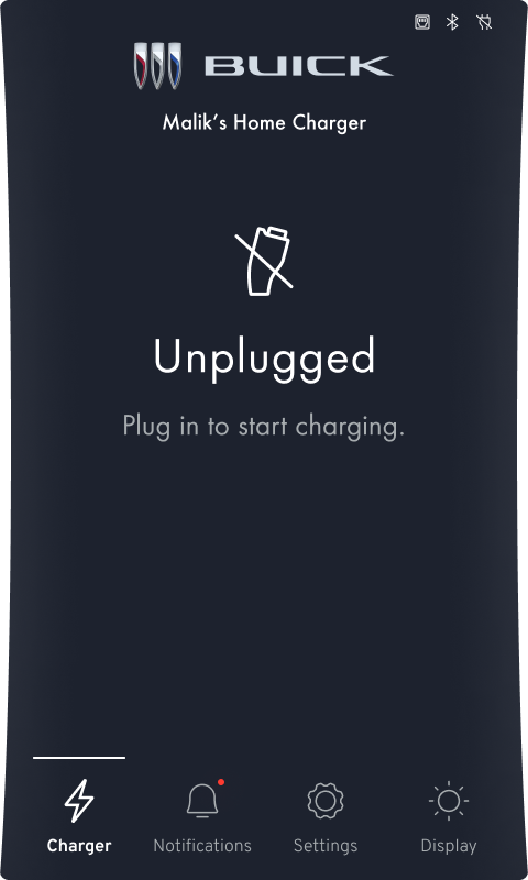
Onboarding
Settings
Notifications
Tutorial
Brightness
Sleep Mode
Dashboard
Notifications
Icon Development
A universal set of safety-critical status icons was needed for the UI. I started with an audit of iconography in my user’s journey – branded mobile app, in-vehicle interface and charge port for color and behavior. I created a few new icons and altered existing designs where needed.


Dashboard
The goal was to strike a balance between functionality and brand DNA. Color, typography and shape are the three aspects of design I leveraged to systematically define a solution that felt cohesive for each brand’s user journey.


1 / 16 Design Language
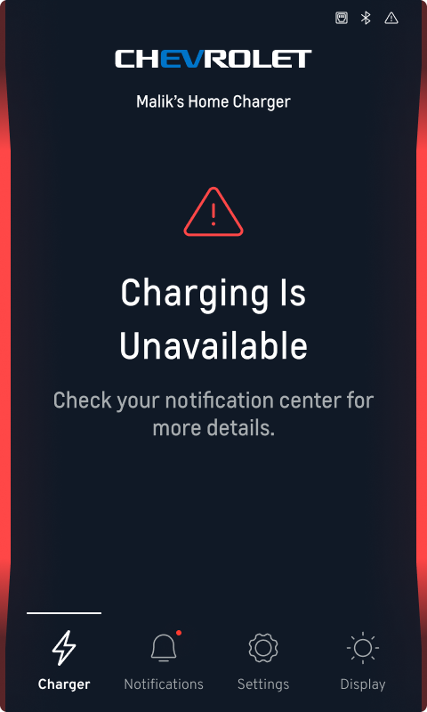
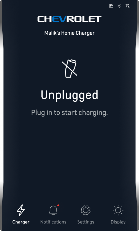
Chevrolet
2 / 16 Style Guide


3 / 16 Charge Status
5 / 16 Design Language
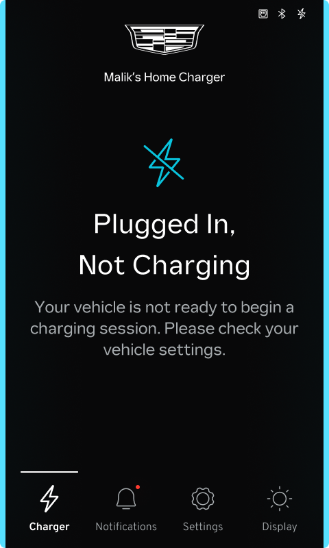
Cadillac
6 / 16 Style Guide

7 / 16 Charge Status
9 / 16 Design Language
GMC

10 / 16 Style Guide

11 / 16 Charge Status


13 / 16 Design Language
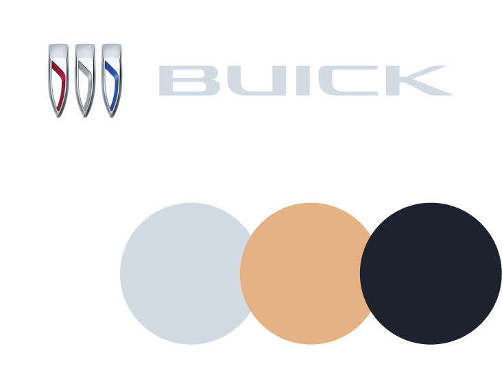
Buick

14 / 16 Style Guide

15 / 16 Charge Status