
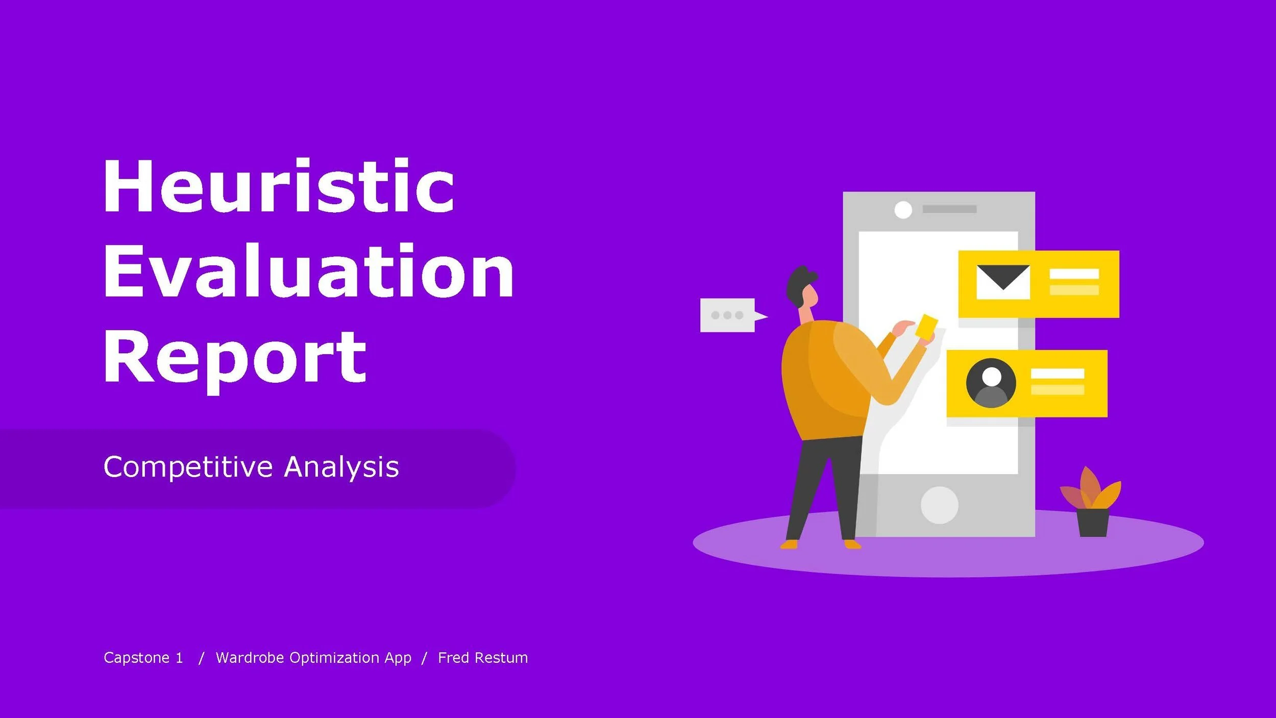
Wear Mobile App
Wear is a conceptual wardrobe organizer app. This project was my capstone assignment when enrolled at Springboard. Wear culminates the entirety of my nine month long UX/UI Design Bootcamp curriculum.

Roles & Responsibilities
User Interviews
Synthesis & Affinity Mapping
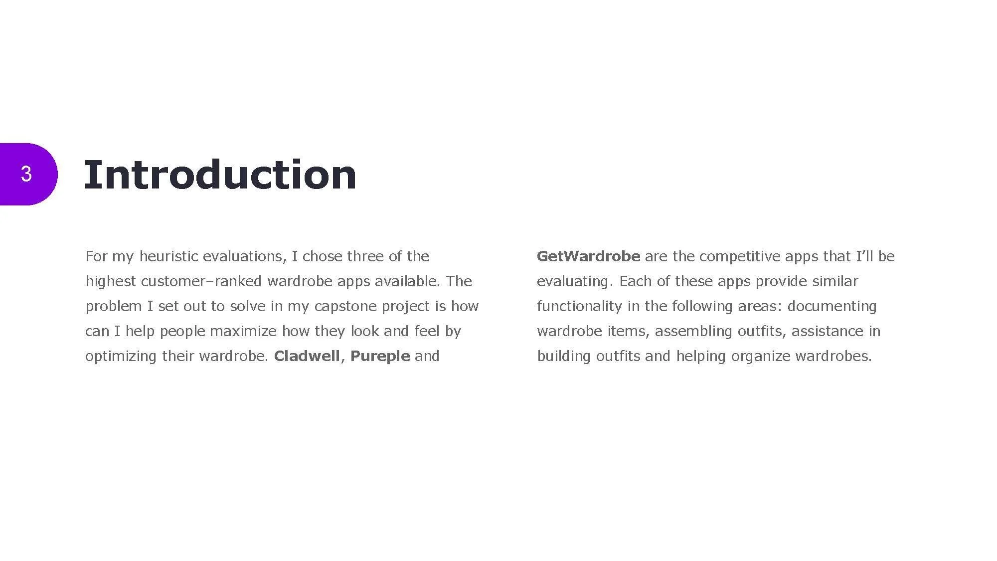
Competitive Research & Analysis
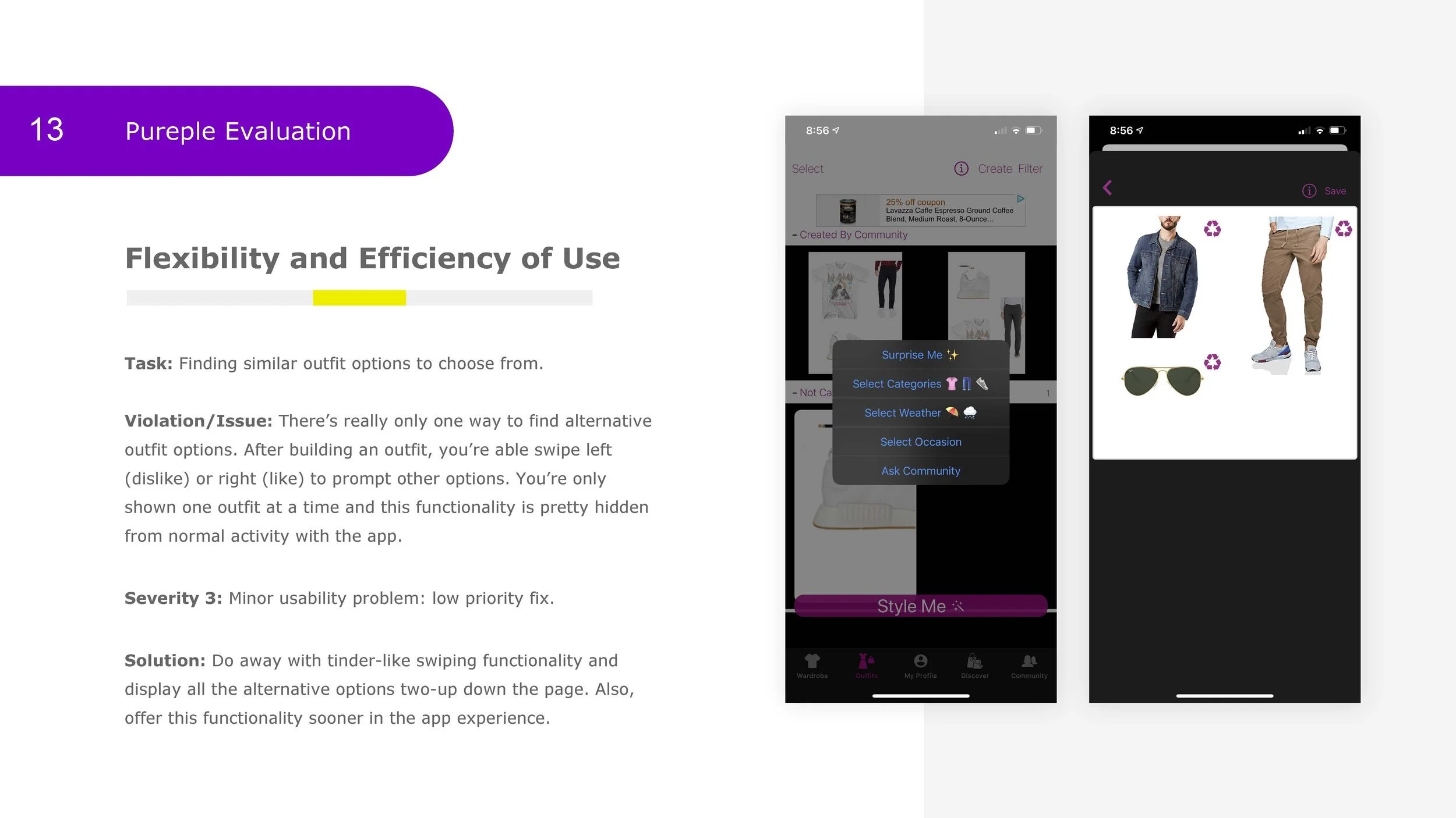
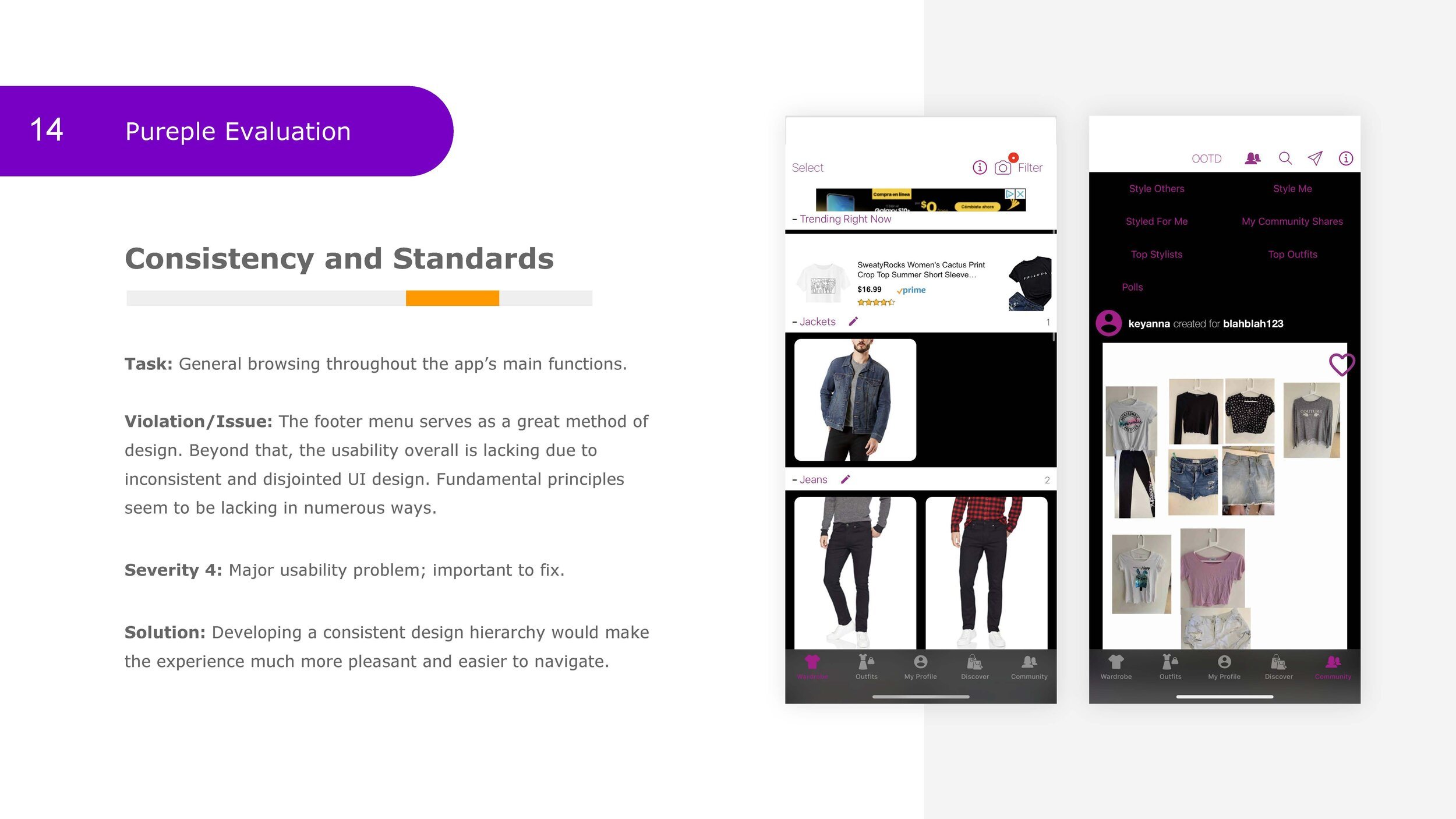
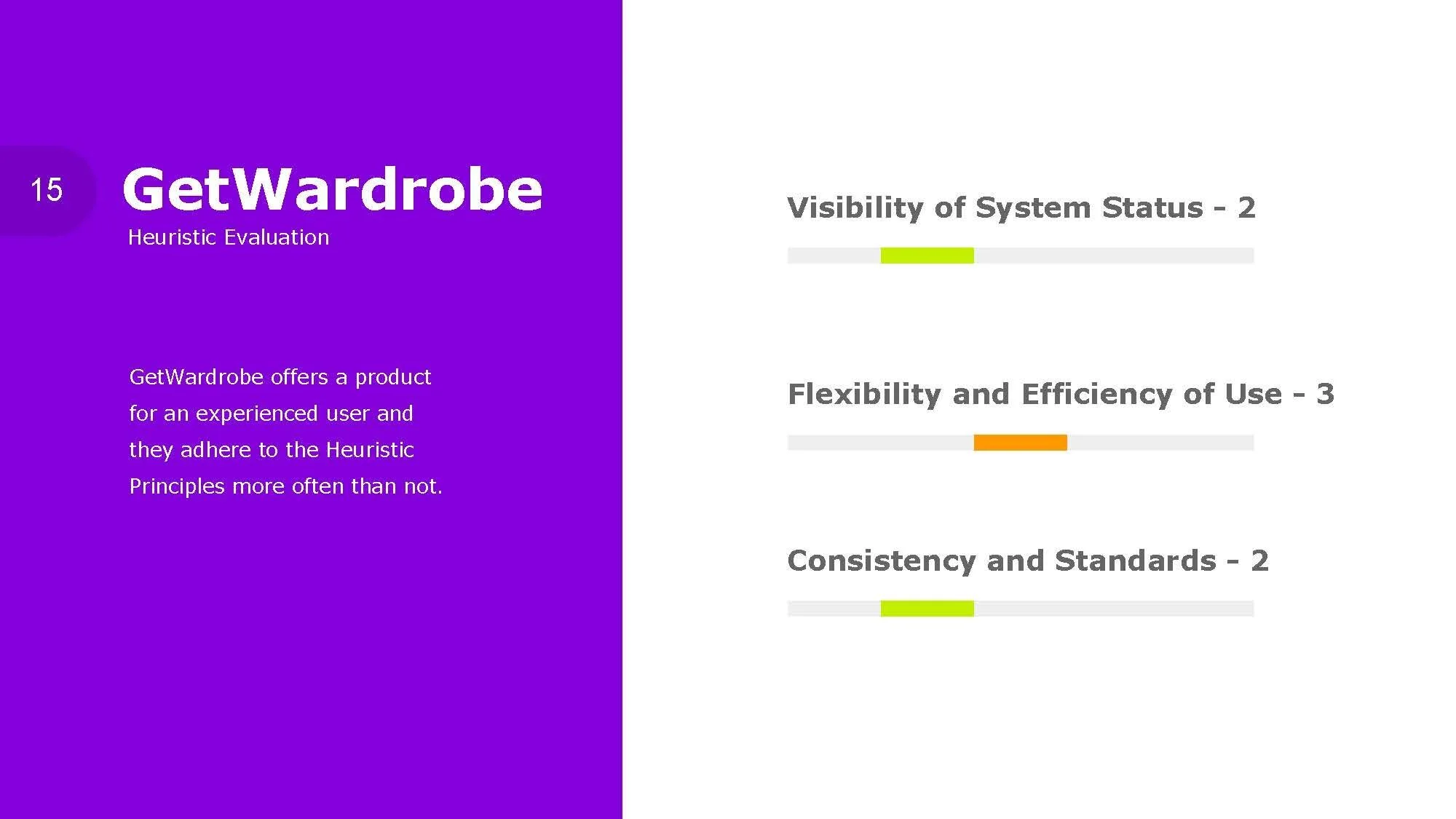
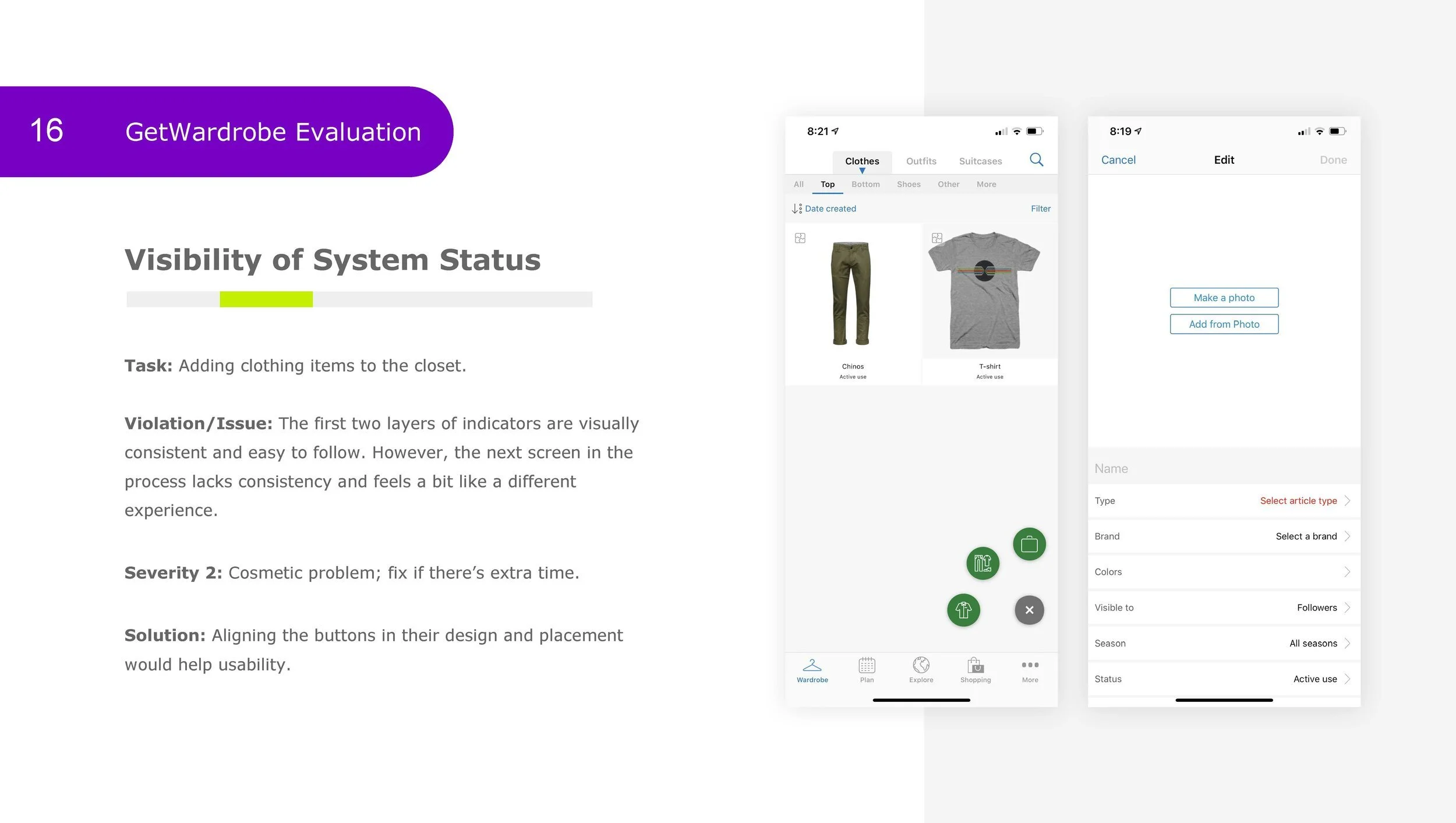
Competitive Heuristic Evaluations
Empathy Mapping
User Personas
Problem Statements
User Stories
User Flows
Site Mapping
Wireframes & Wire Flows
Brand Platform & Style Guide
UI Design System
High Fidelity Designs
Prototyping
Usability Testing

Feature List
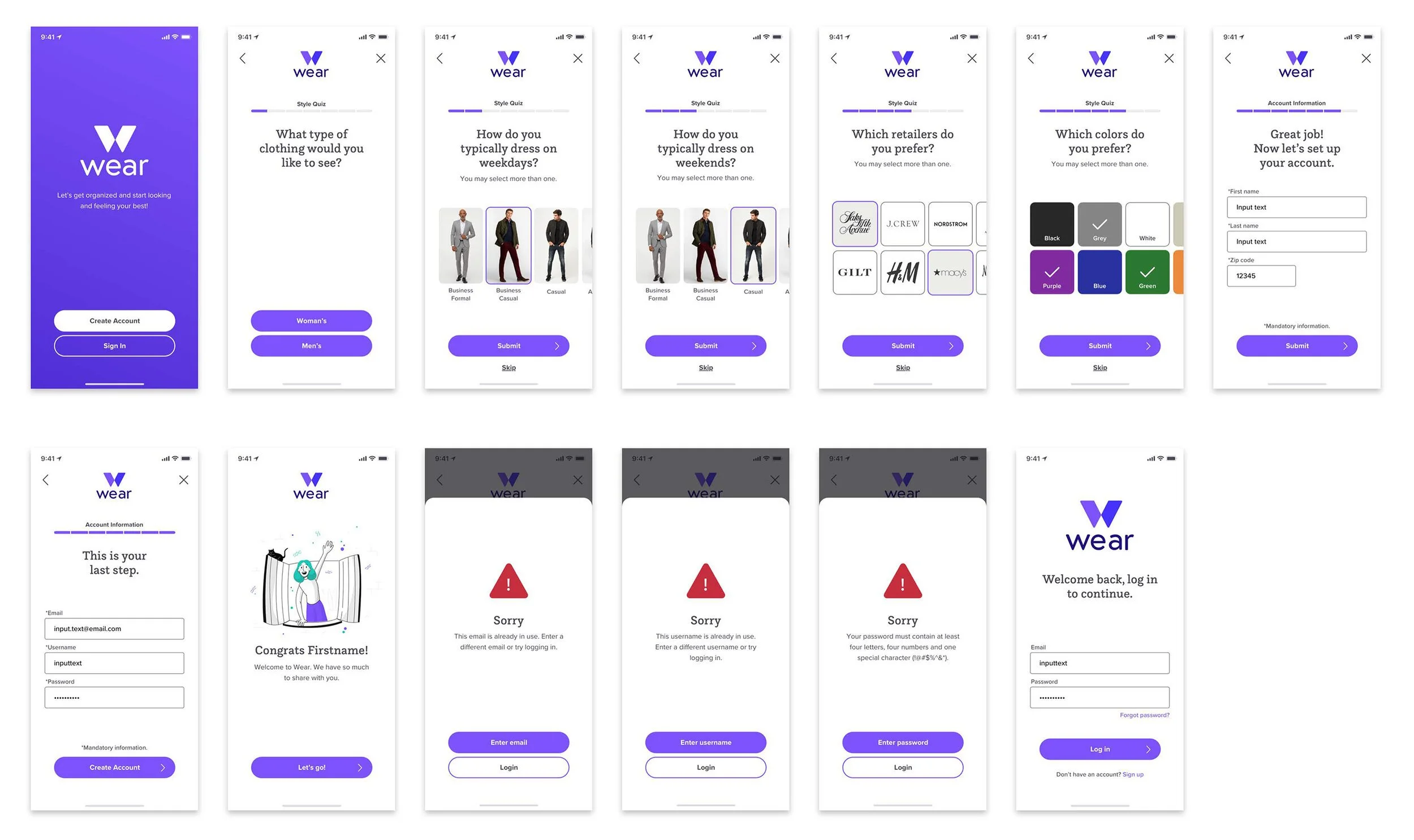
Splash
Onboarding
Style Quiz
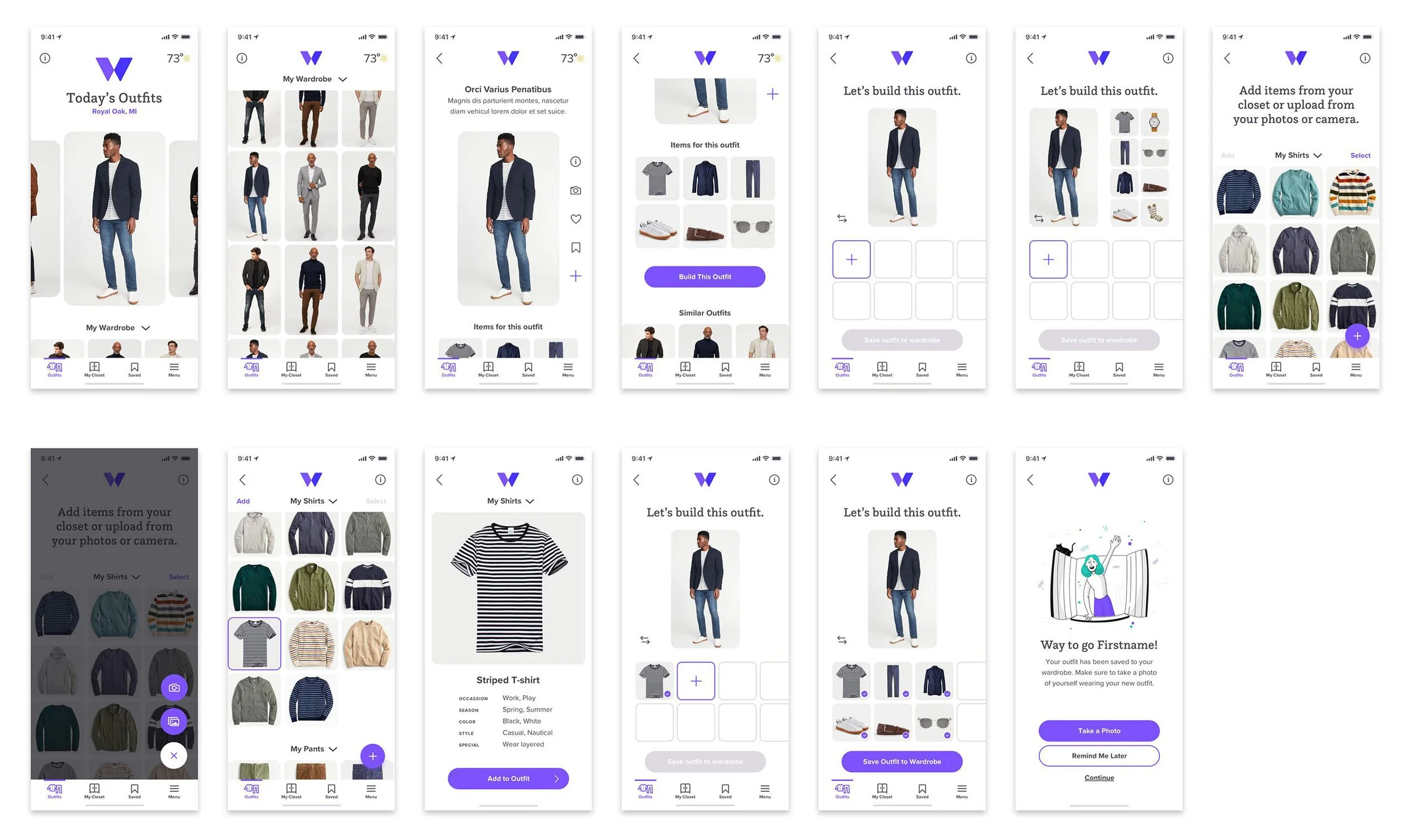
Dashboard
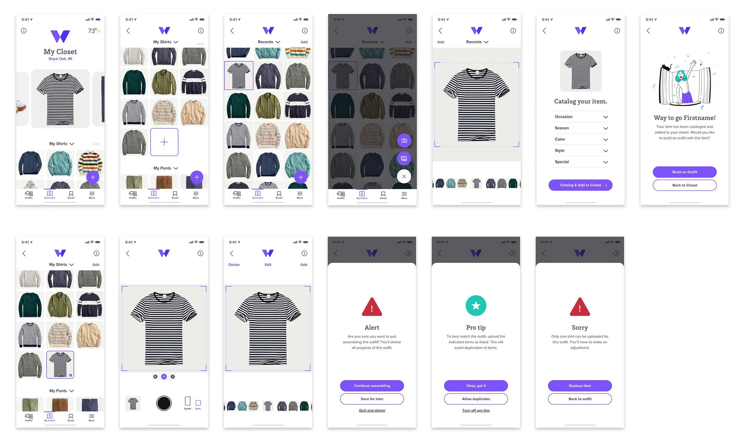
Catalog Clothing
Assemble Outfits
Human Centered Design Process
I followed the Human Centered Design Process in the development of this app playing the roles of UX Researcher, UX Designer, Product Designer and UI Visual Designer. I involved the end-user right from the beginning and placed them at the center of the process. I focused on how they think, behave and feel. Below are the steps that lead my process.
1 Empathize
2 Define
3 Ideate
4 Prototype
5 Test
6 Implement
Empathize
Primary Research:
User Interviews
Empathize 1
After screening about 25 people, I narrowed down the list and conducted structured interviews with five unique participants. The findings from these interviews will serve as the foundation of my qualitative data throughout this assignment.
Synthesis &
Affinity Mapping
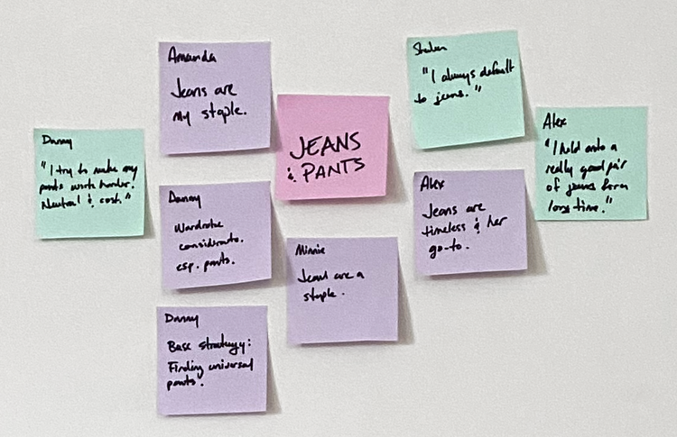
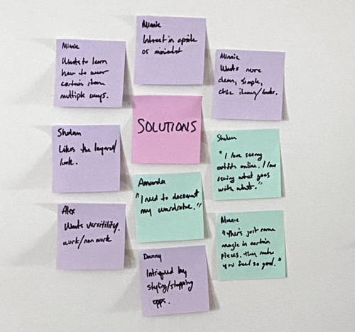
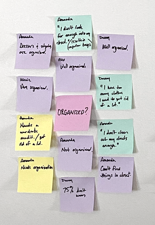
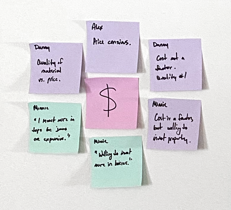
Empathize 2
As my interview information began to take shape through the affinity mapping process, I found that my users’ have similar wants and needs to varying degrees. The most significant and common themes are shown below.


Secondary Research:
Online
Empathize 3
In addition to user interviews, I conducted an extension search for secondary information by scouring through the internet – fashion articles, industry blogs, reports on psychology and clothing. Below are the three most significant findings from this research and a relative bit of advice from one of our nation’s founders..
Psychology of Clothing
The perception of vanity tends to overshadow the psychological benefits.
Common Challenges
Lack of knowledge. Understanding some simple principles and guidelines can help unlock problem solving potential.
Practical Solutions
Simplifying wardrobe options to include more interchangeable and versatile items. Documenting your wardrobe. Minimalist or capsule wardrobe solutions.
“For every minute spent organizing, an hour is earned.”
“Perhaps our closets are the best illustration of this sentiment—a closet bursting with clothes translates to time wasted digging through piles and putting outfits together on Sunday nights. The opposite then must be true: a streamlined closet filled with wardrobe essentials saves precious time.”
Benjamin Franklin
Empathize 4
Insights
Below are the critical insights that I discovered throughout my research. These user insights will provide guide rails for all my decision making moving forward.
People recognize the psychological benefits from having an organized and well planned wardrobe, but they lack the expertise and time to achieve this.
People make a lot of sacrificial decisions because of their feelings and challenges.
People tend not to think of their wardrobe holistically.
General lack of knowledge or guidance becomes detrimental.
There’s a general lack of pre-planning and an abundance of instinctive decision-making
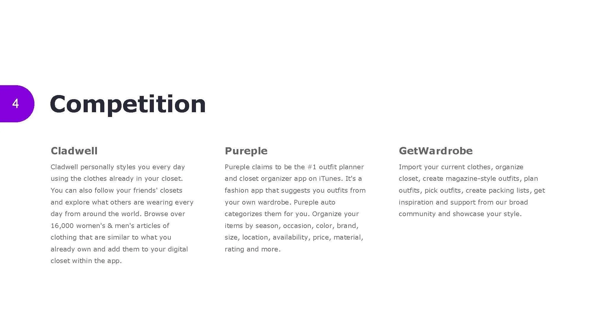
Competitive
Research & Analysis
Empathize 5
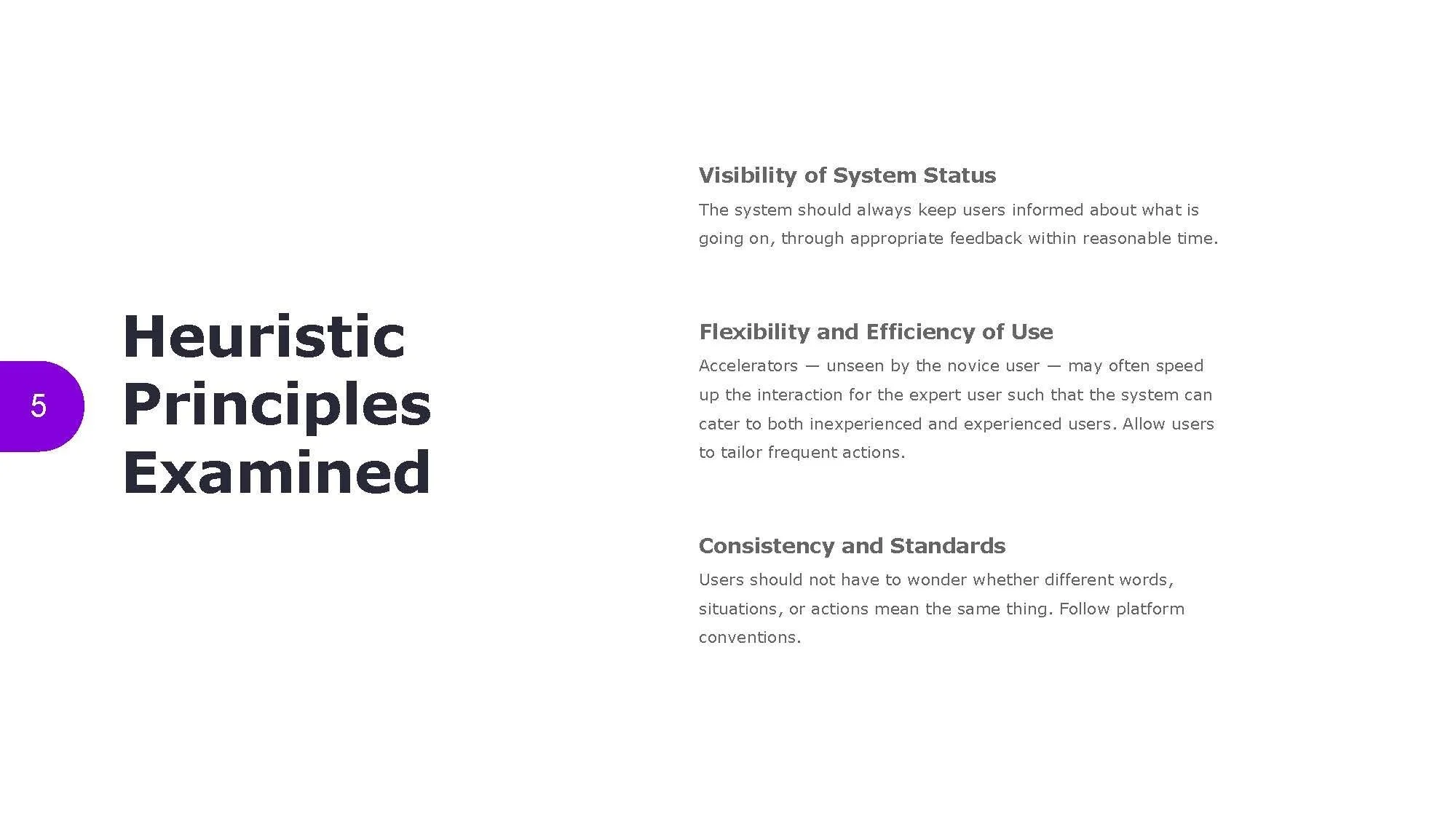
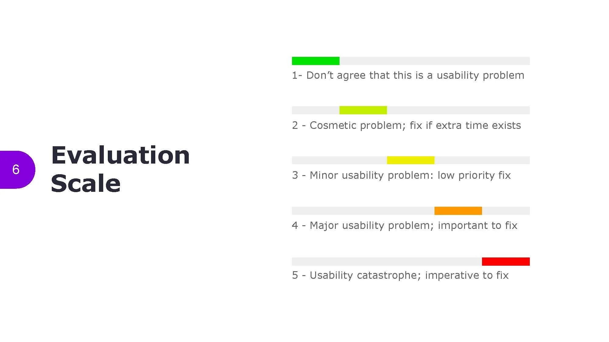
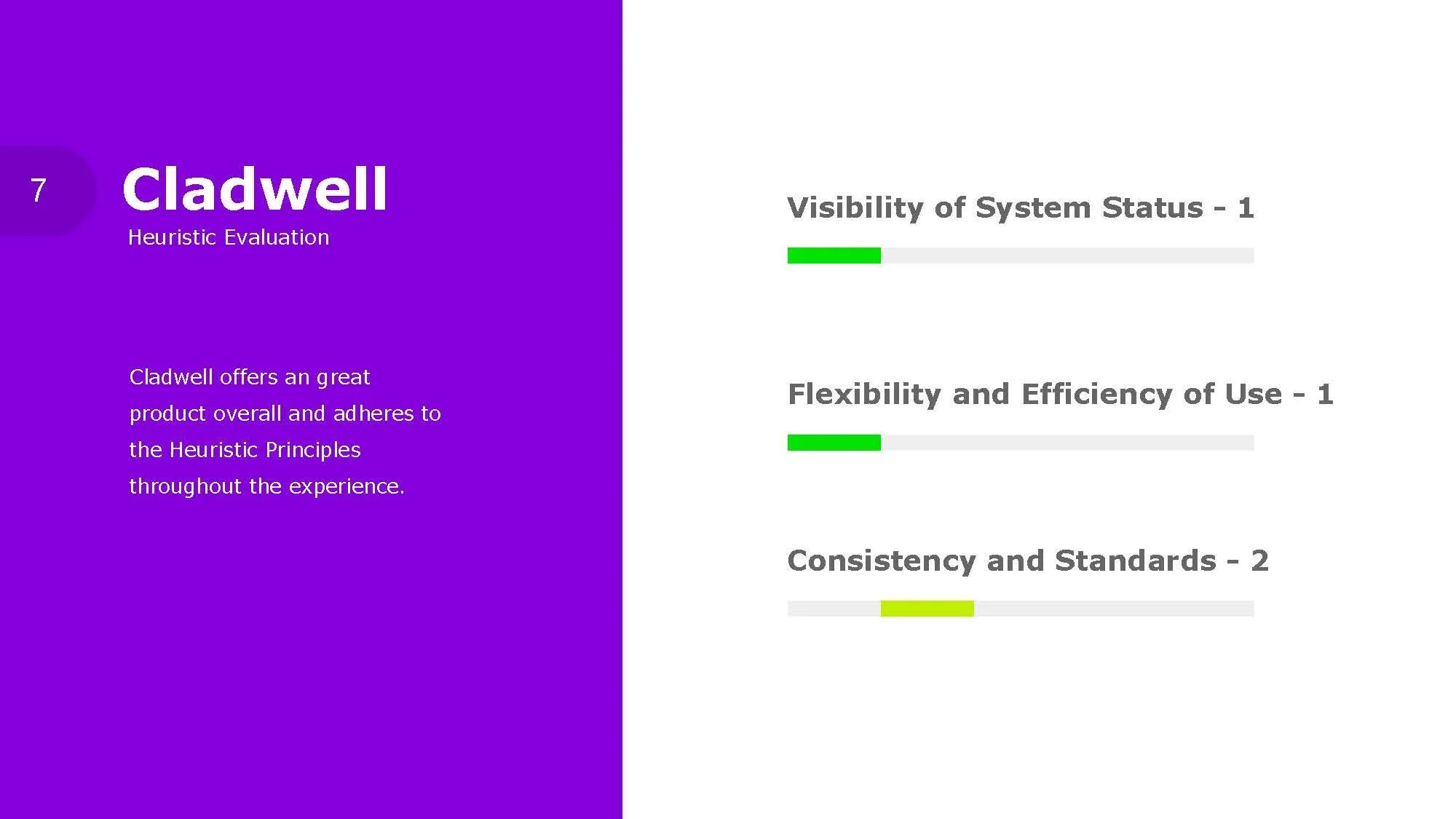
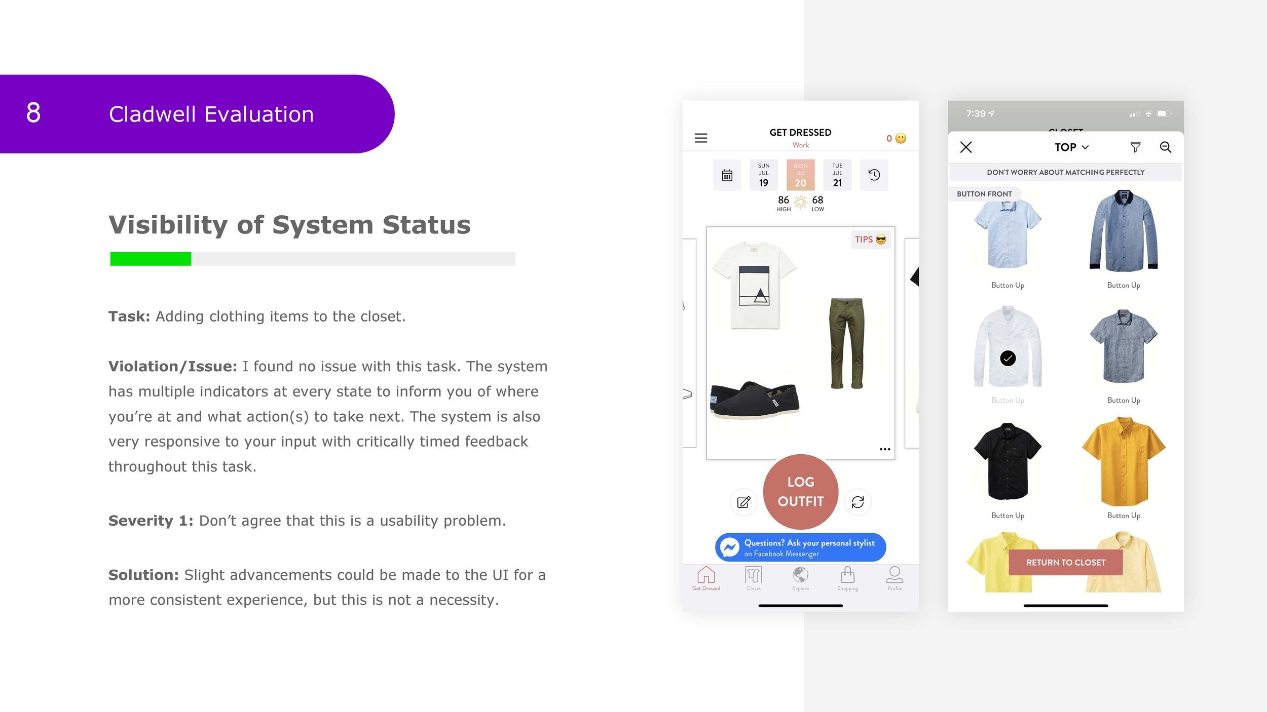
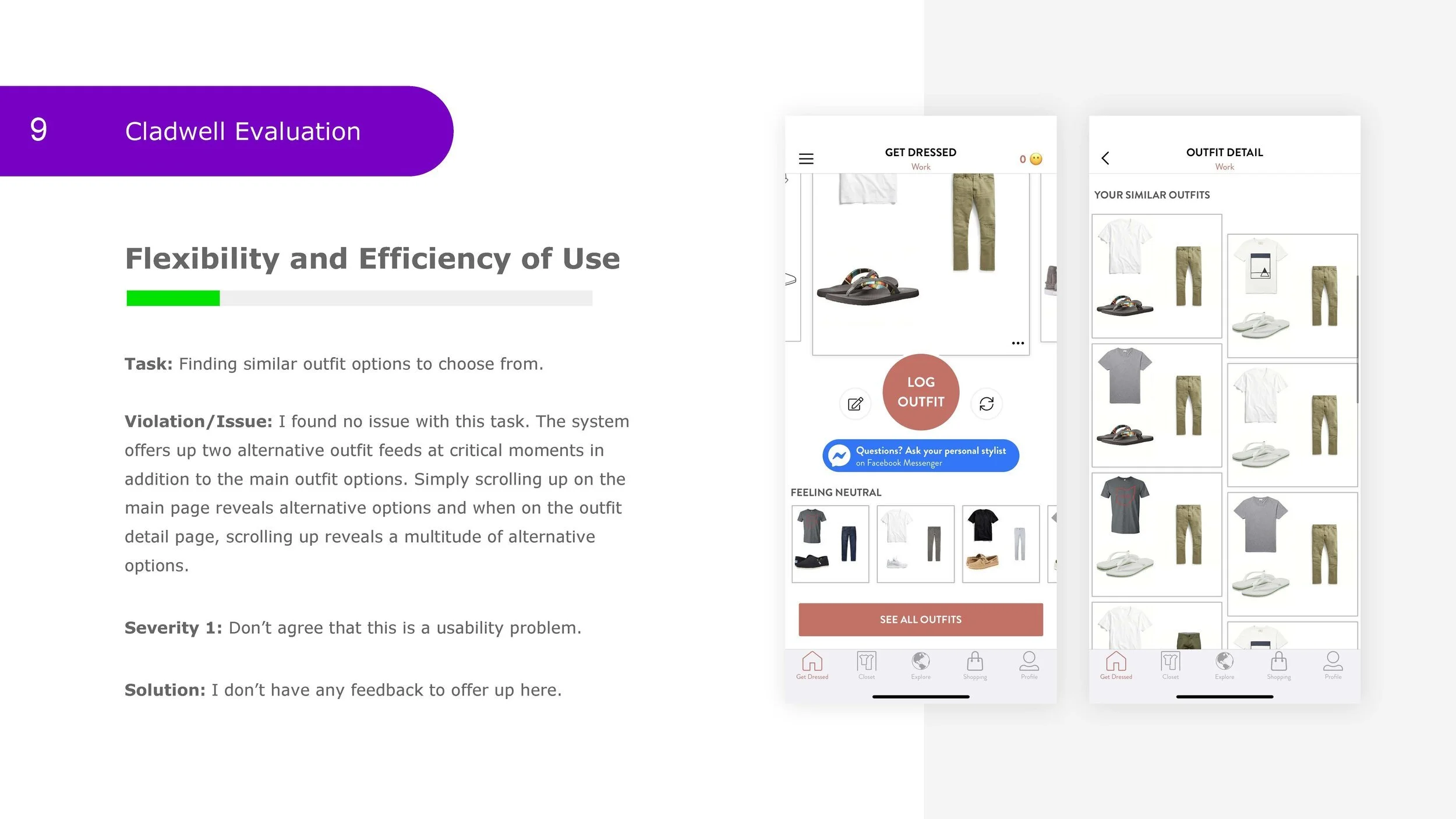
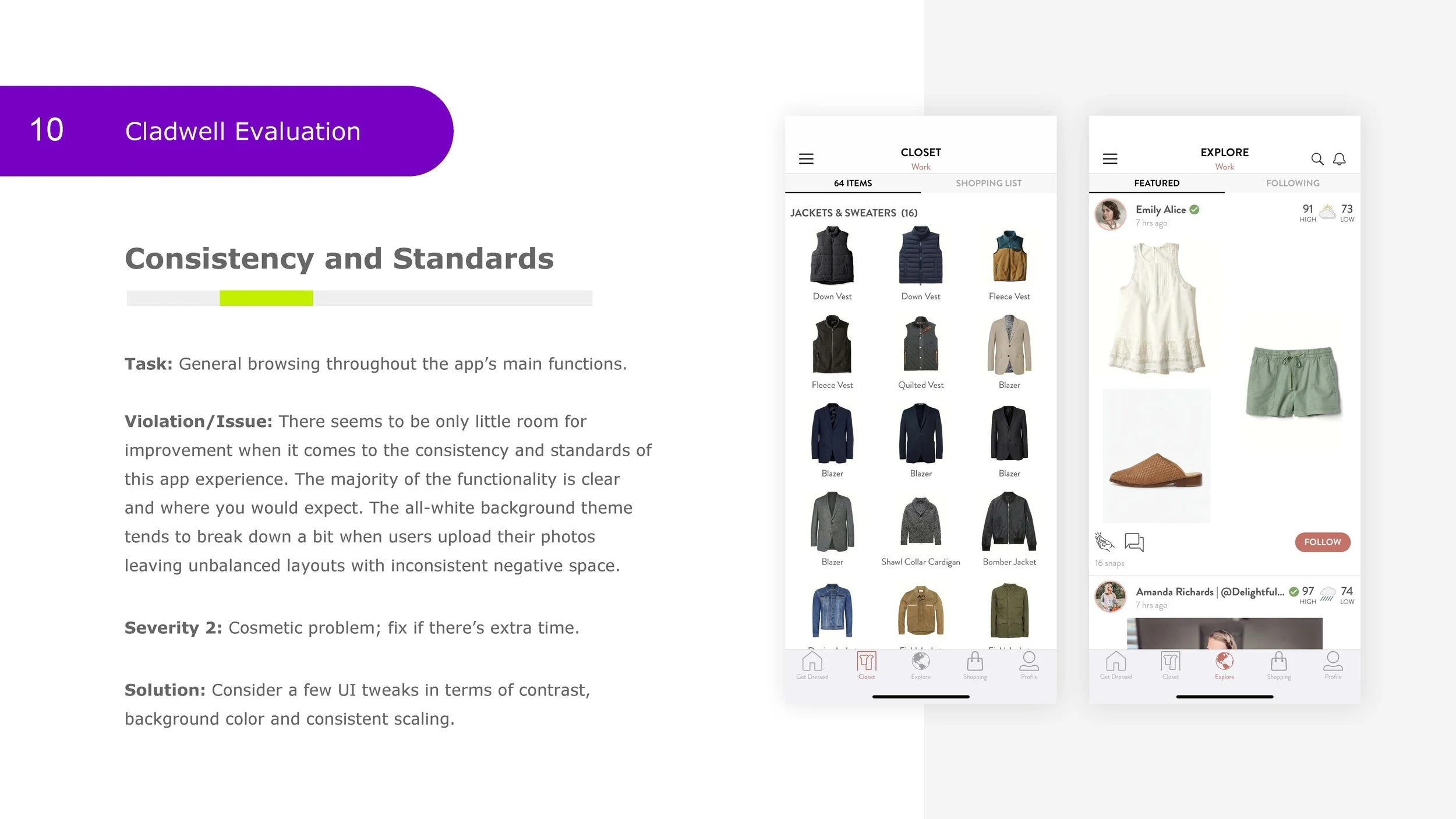
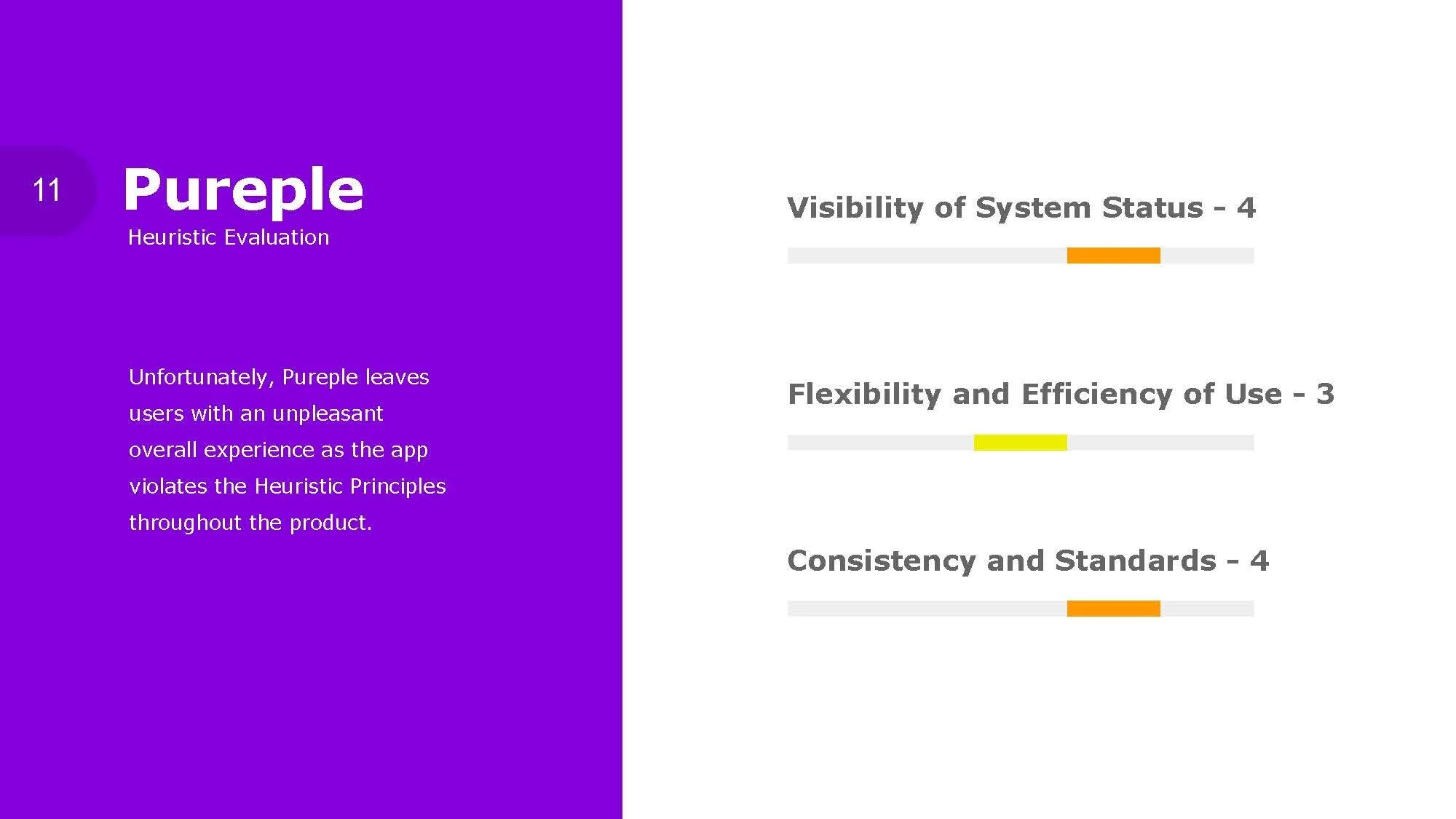
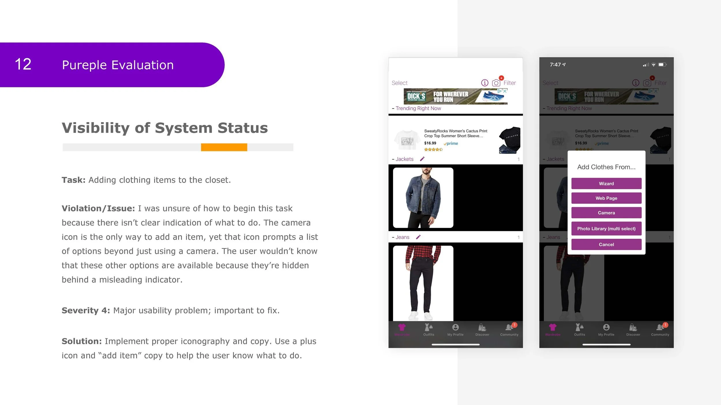
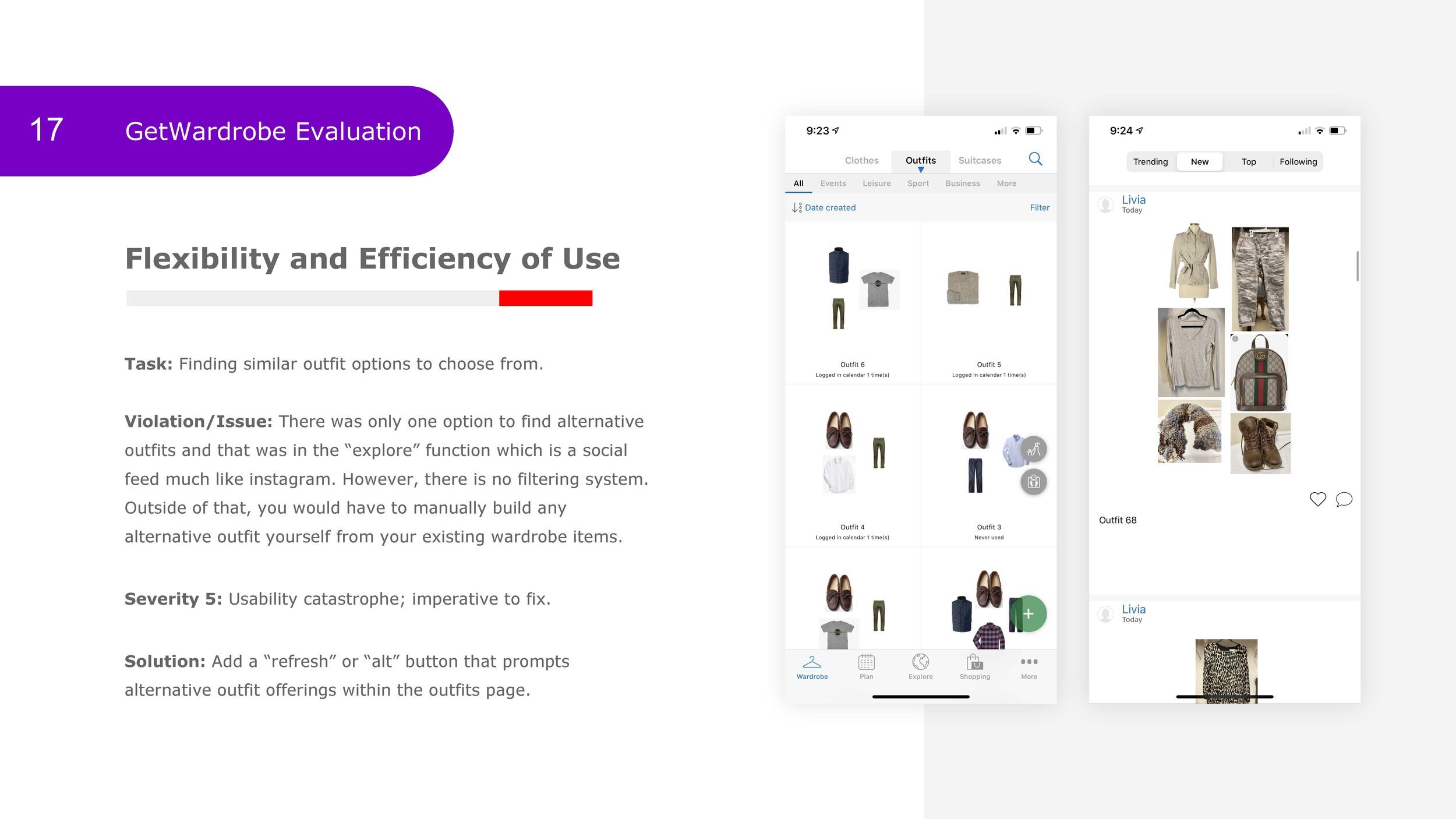
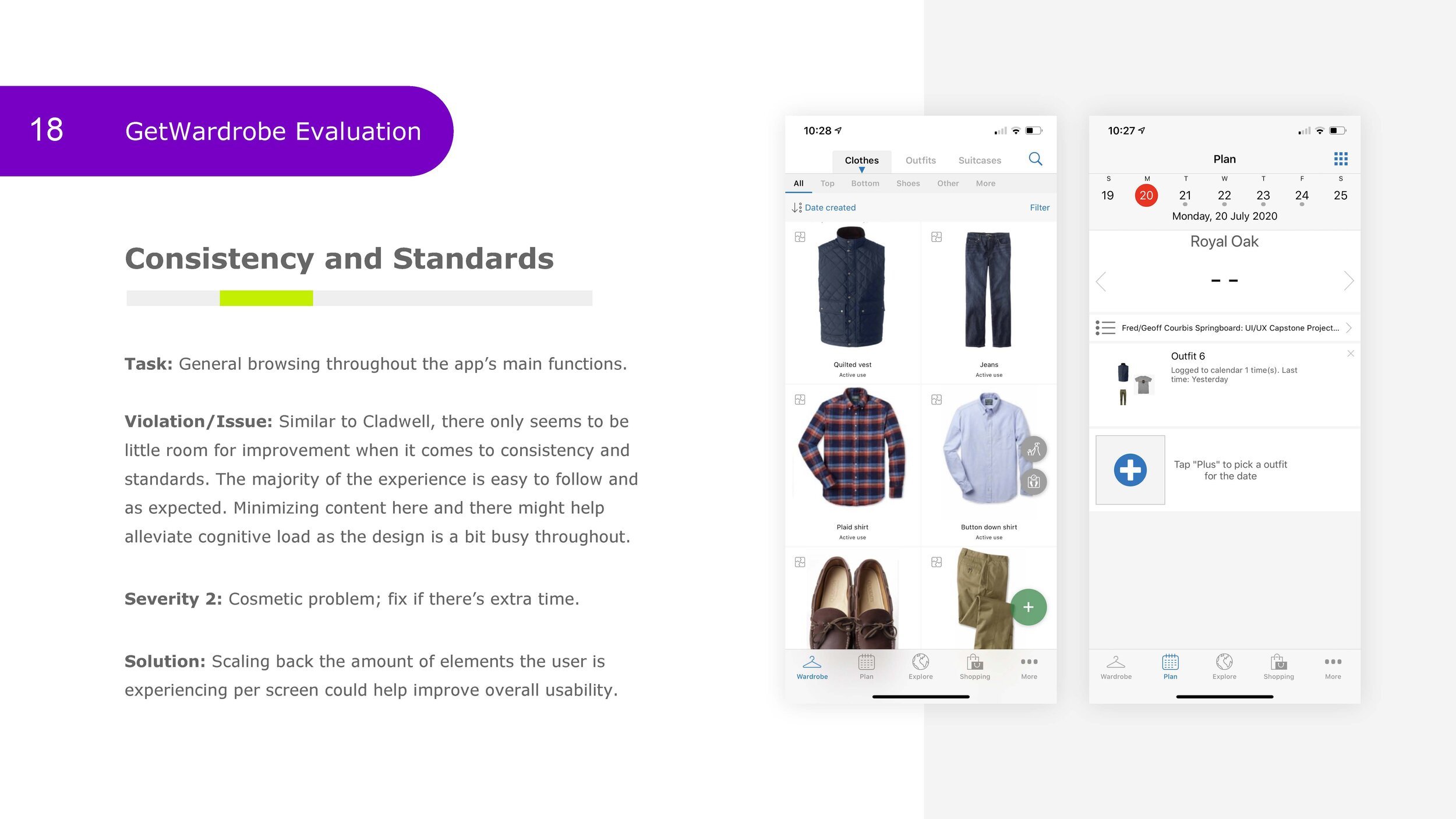
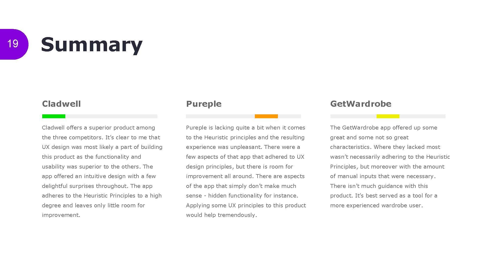
I executed a Heuristic Evaluation Report on three major competitors. At their worst, the competition didn’t follow Heuristic Principles at all resulting in frustration and difficulties. My findings listed here helped to uncover improvement opportunities for my design.
Ensure heuristic principles are being implemented.
KISS. Follow logic, especially in the organization of content.
Ensure more than one way to accomplish a task.
Aesthetic qualities are significant and translate to trust, confidence and delight.
Teach the user about the experience. Explain the functionality.
Define
Define 1
Empathy Mapping
Through the empathy mapping process, it was clear that the users’ needs and wants overlapped quite a bit. However, I found that we could separate the users into two groups based on their level of aptitude:
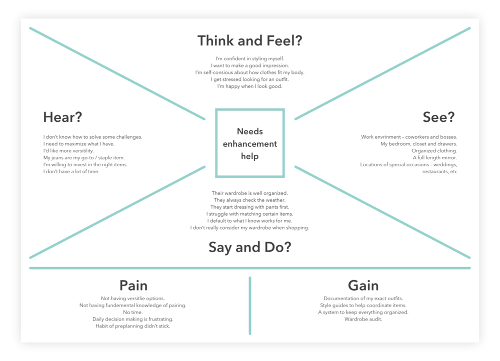
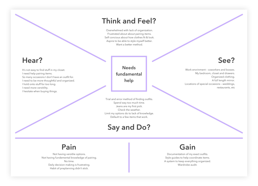
Define 2
Personas
Guided by the Empathy Map results, I developed two different users personas to best represent the needs of each user group:
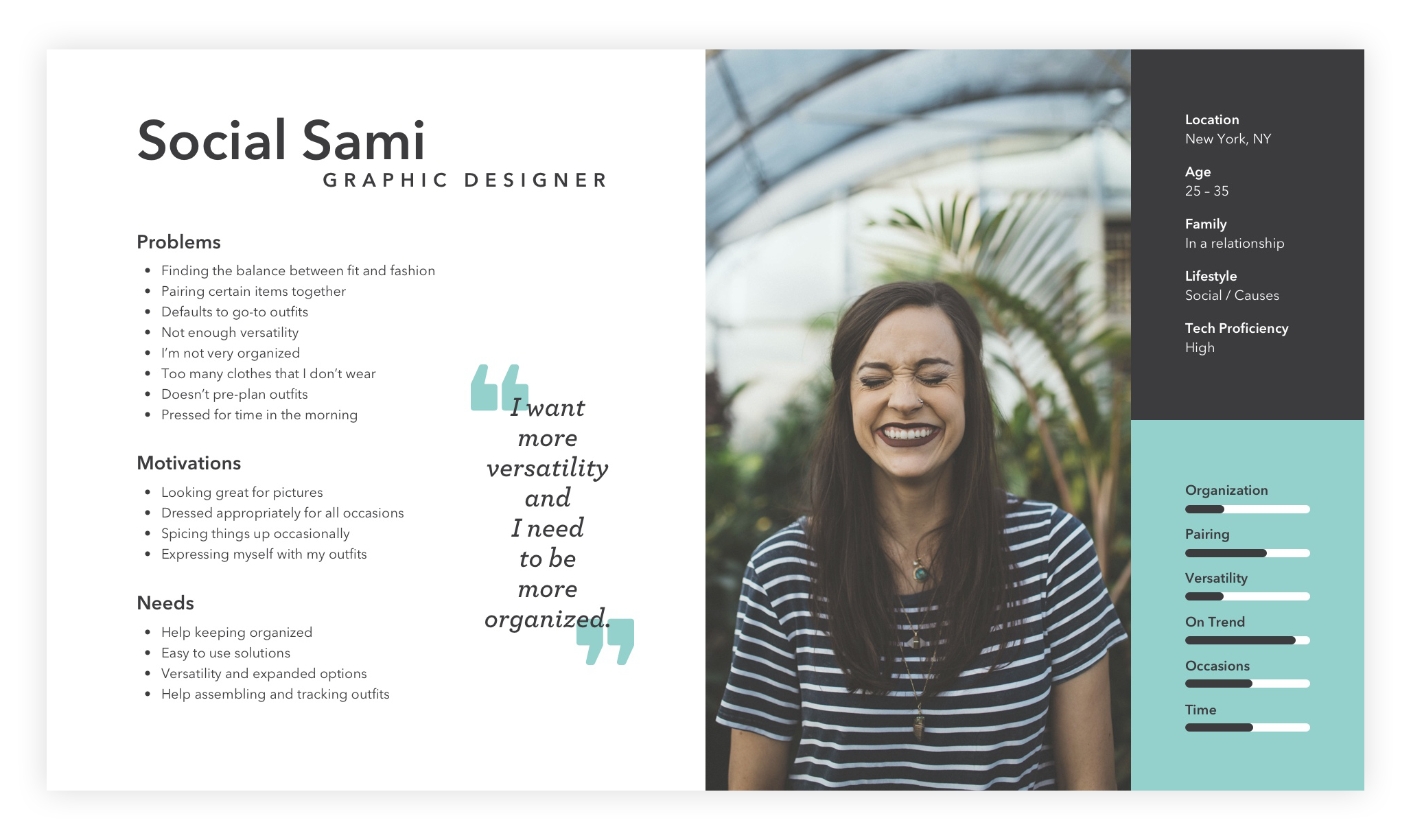
Needs enhancement
25-35 / NYC
Graphic Designer
One wardrobe
Experienced
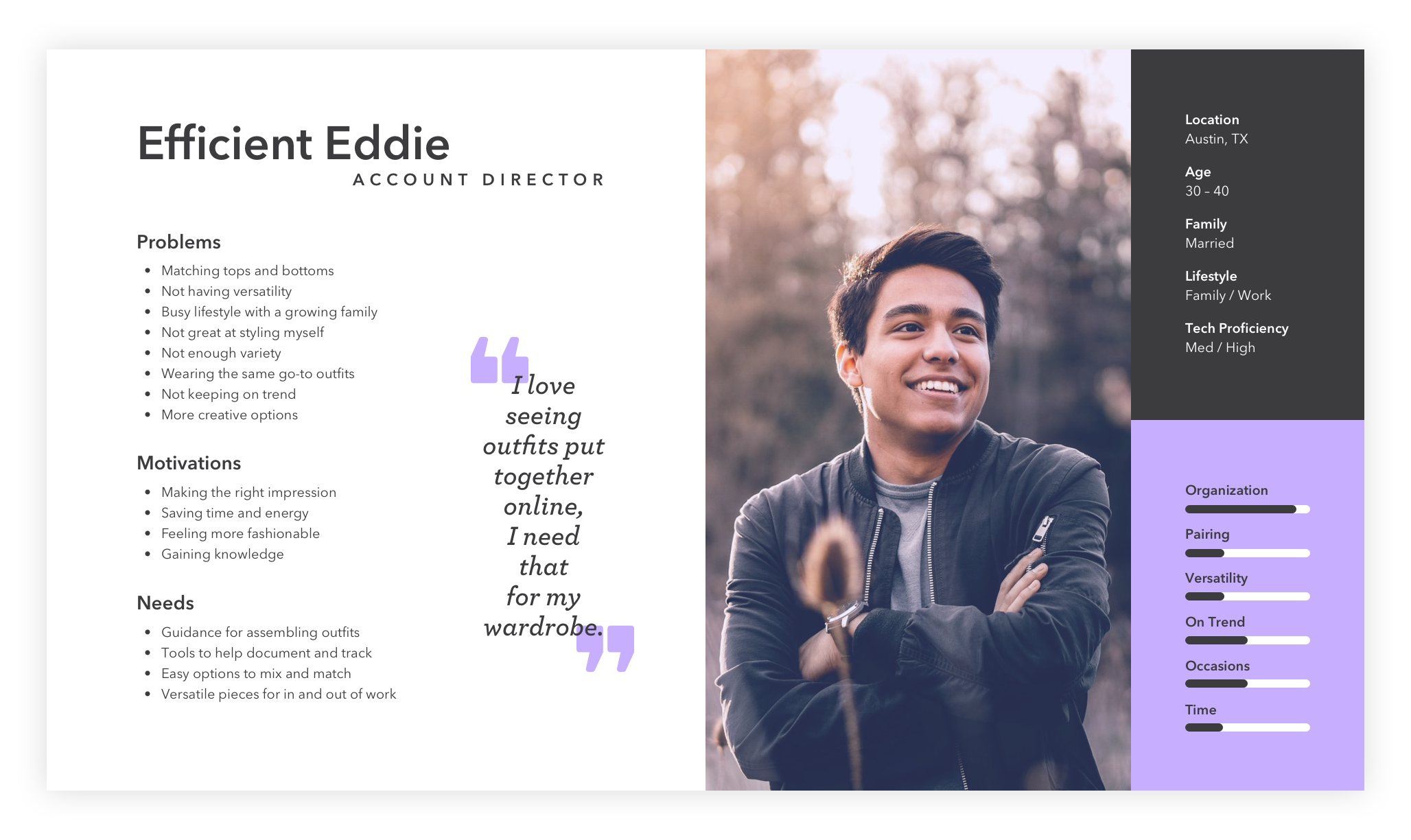
Needs fundamental help
30-40 / Austin, TX
Account Director
Two wardrobes: Work & Non work
Novice
Ideate
Problem Statements
Ideate 1
At this point, I’ve amassed an extensive amount of data and insight which allows me to empathize with the user’s wants and needs. They struggled most with the complexity of assembling outfits. They also lacked the ability to maximize their current wardrobe.
I needed a system that delivered a variety of solutions based on clothes they already own. With that in mind, I start defining specific problems to solve for them. I did this by asking a series of “how might we” questions. How might we…
How might we…
eliminate the anxiety of not knowing what to wear?
help people maximize their existing wardrobe?
provide some general guidance and knowledge?
make assembling and picking out an outfit simple and fun?
enable people to look and feel their best?
Ideate 2
User Stories
With plenty of user insight, I was able write each story from my user’s perspective. This helped define their wants and needs and provided clear direction for the product and its red routes. These are the three critical red routes necessary for the MVP to be viable.

These are the three critical red routes necessary for the MVP to be viable.
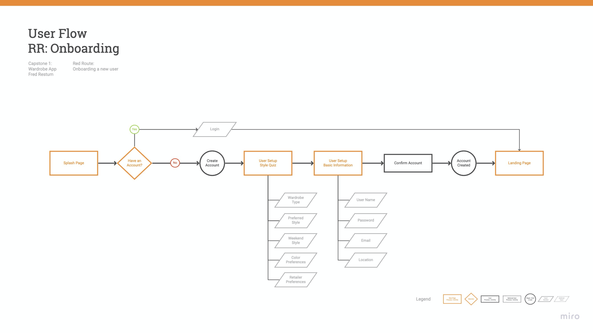
Onboarding
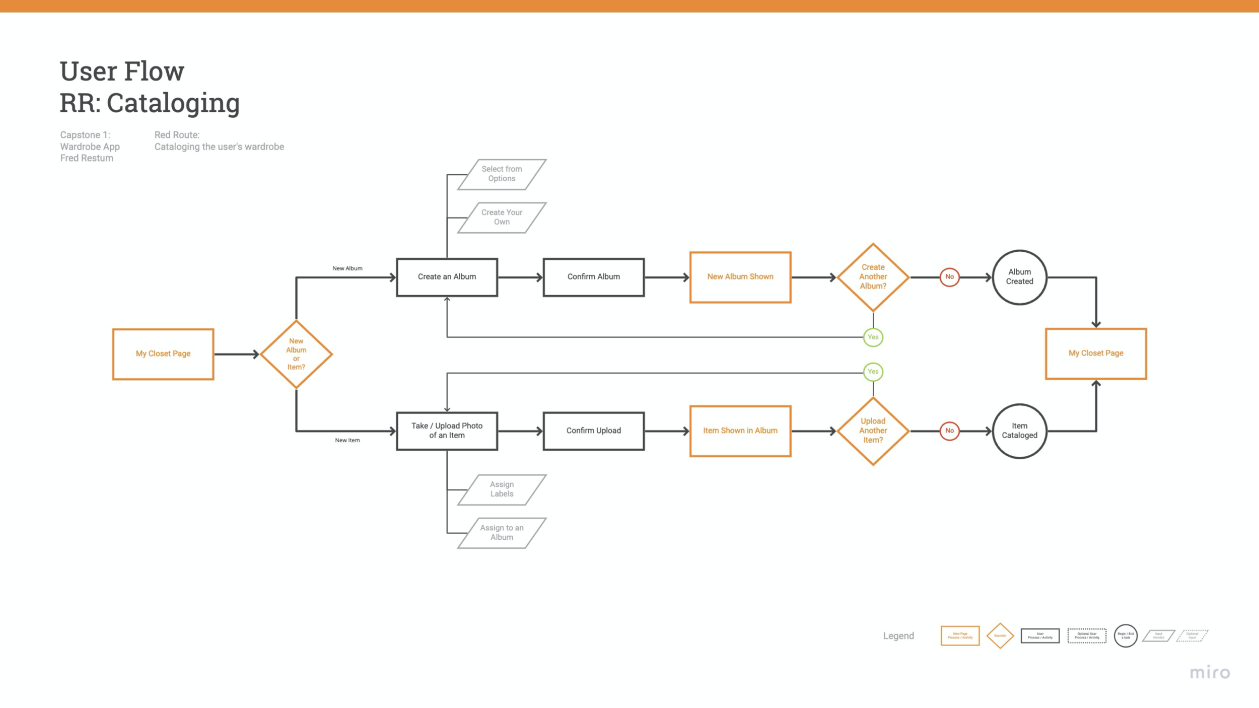
Uploading clothing
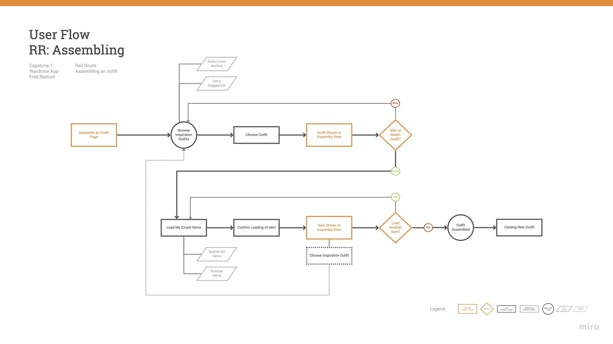
Assembling outfits
Ideate 3
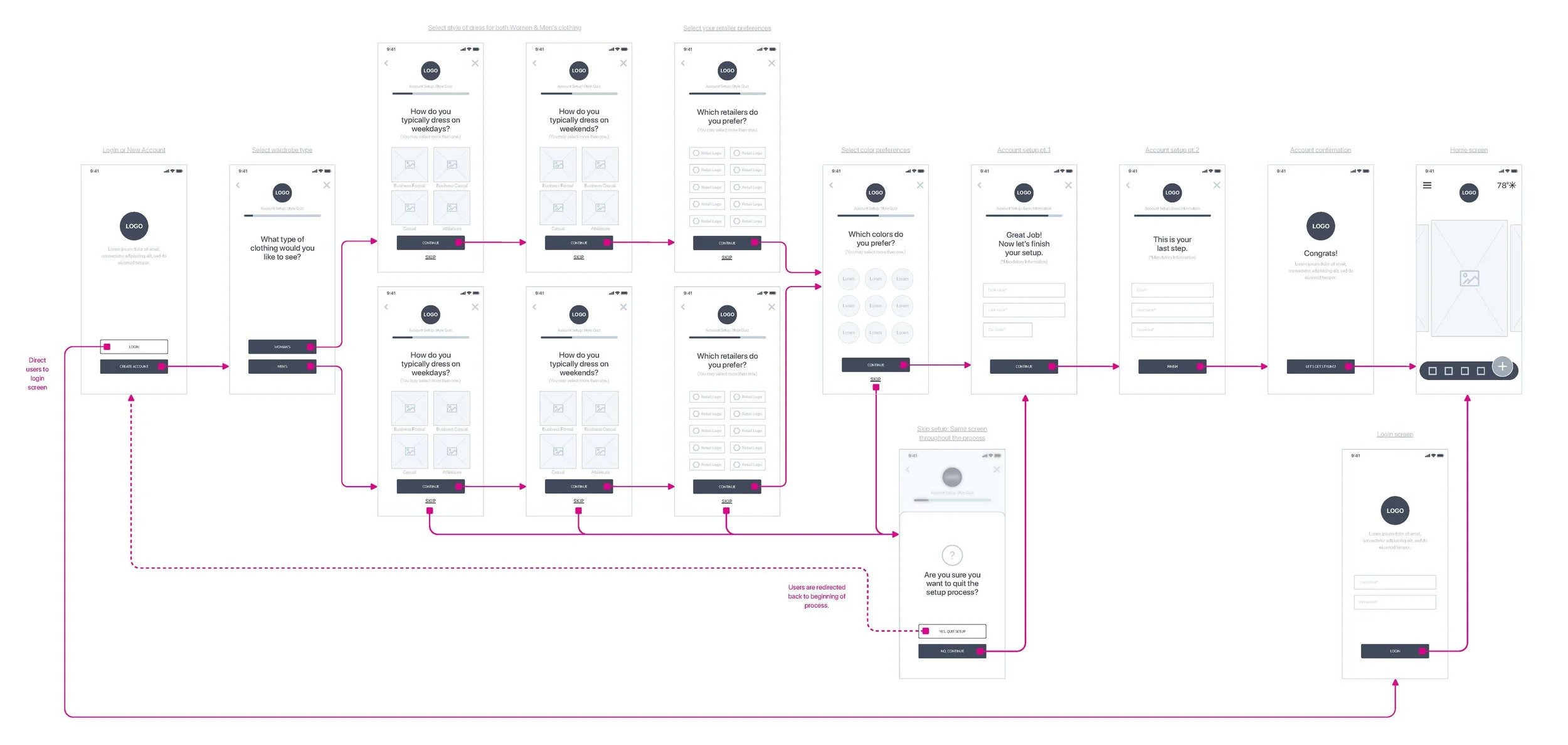
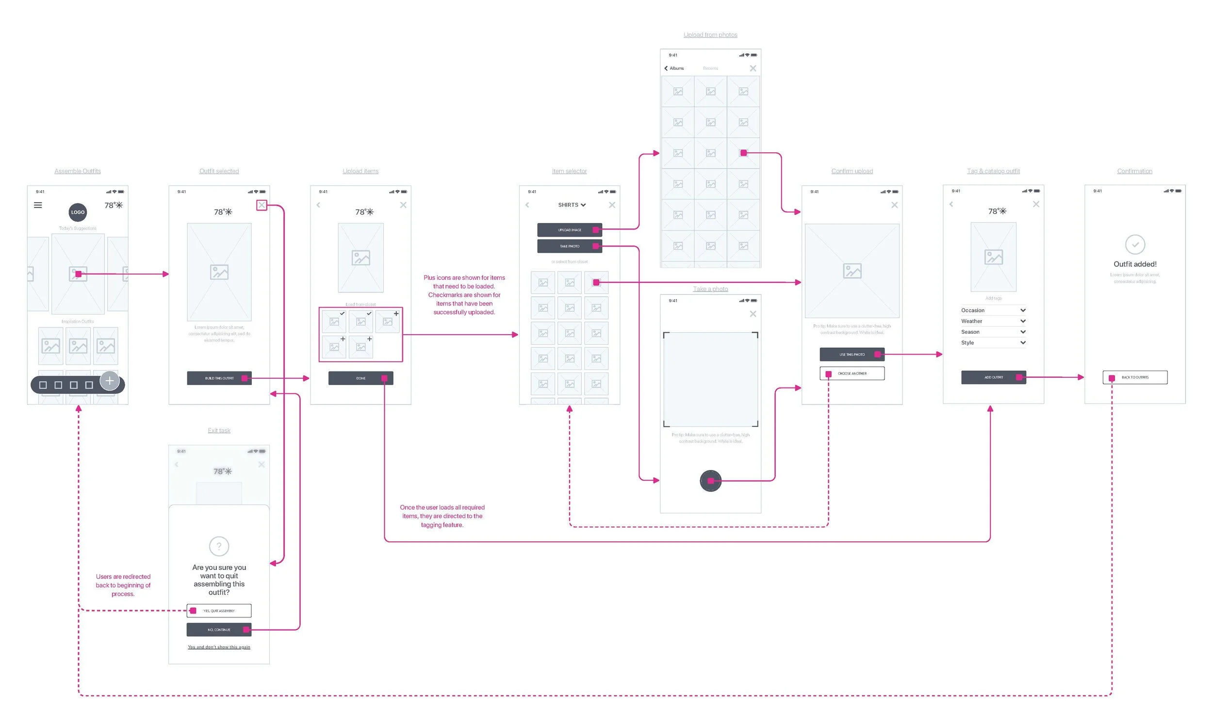
User Flows
The red routes then needed to be defined sequentially, each with their own end-to-end user experience. I defined exactly what steps the user needed take to complete each task in the simplest way possible.
Ideate 4
Site Map
With the red routes defined and flows in hand, I was able to see how the app would begin to take shape. This helped to inform the organization of content, features, navigation and ultimately the structure itself resulting in the site map. The site map reflects a complete app experience. For the sake of this MVP I designed for the red routes which account for about 70% of the site map.

Prototype
Prototype 1
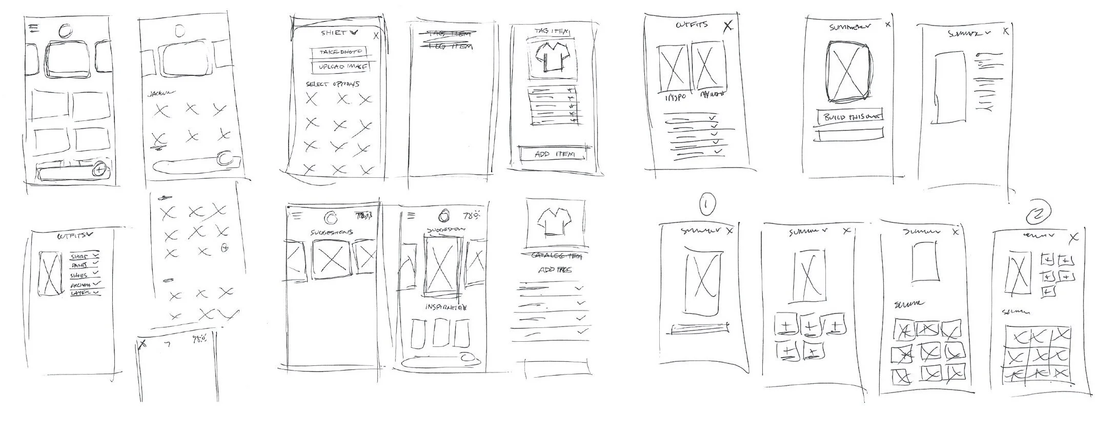
Sketching
It was time to explore ideas of how this product could take shape. This trial and error practice began with very loose gestures of ideas that became more and more refined with each iteration. I was able to develop components, define design details, organize content and ultimately begin to define a systematic approach to my UI. The last step was to deliver refined sketches of each screen in the red routes.

Prototype 2
Wireframes
With the refined sketches as a guide, I began to develop the wireframe layouts for each red route. The feel of the product really began to take shape in this trial and error process. I kept my wires pretty tight in their execution and incorporated some of the design details that help to define the look and feel of my product. This was another trial and error process as I continuously refined screens while applying best practices in both UI design and accessibility.
Prototype 3
Wireflows
Using my wireframes and my user flows as a reference, I began to build wire flows for each red route. As the flows took shape, additional screens and revisions were necessary to continually refine and improve the user experience.
Onboarding
Outfit Assembly
Brand Platform &
Style Guide
Prototype 4
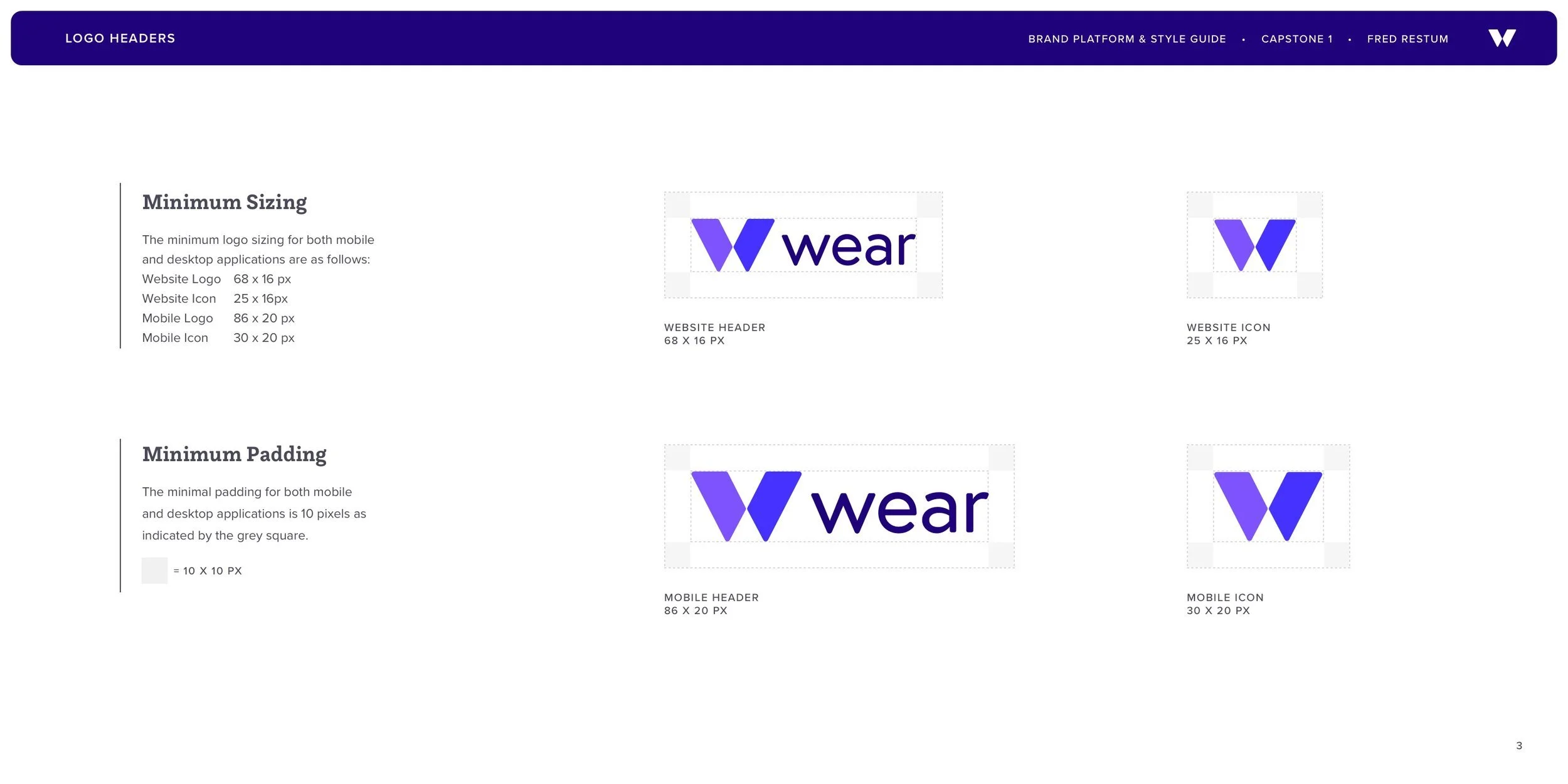
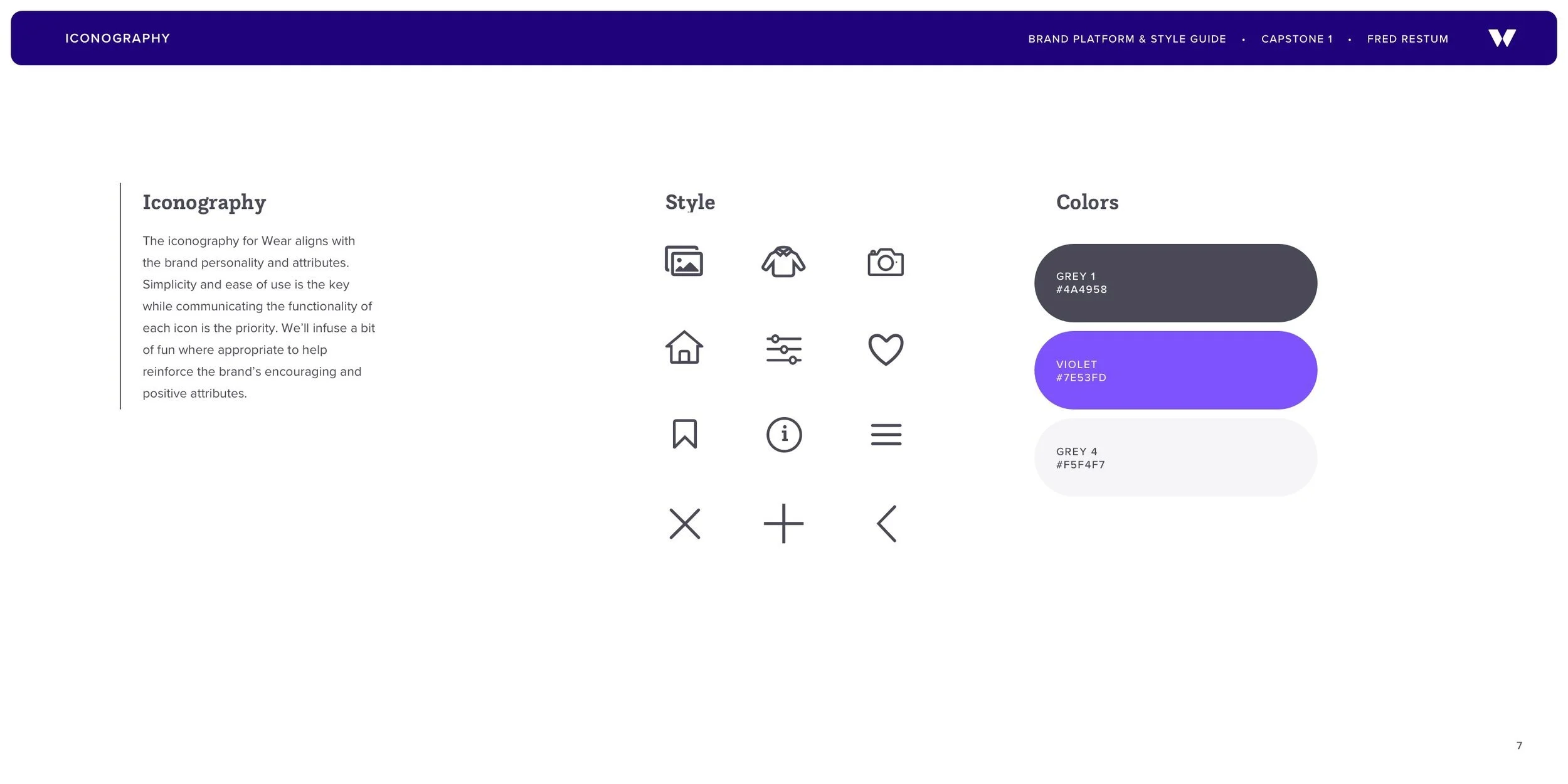
As part of this project I developed a brand platform and style guide. I began by developing a mood board. From there, I developed the brand’s vision, personality and mission as well as the visual characteristics that define the brand.


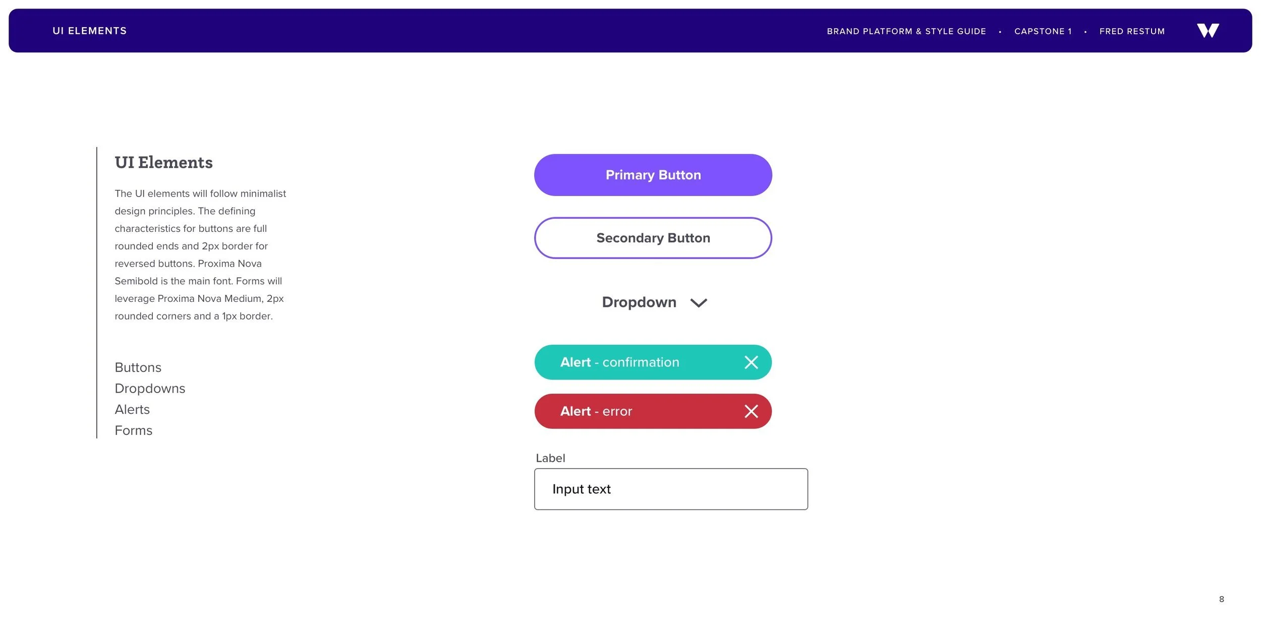

Components & Symbols
Prototype 5


High Fidelity UI Designs
Prototype 6
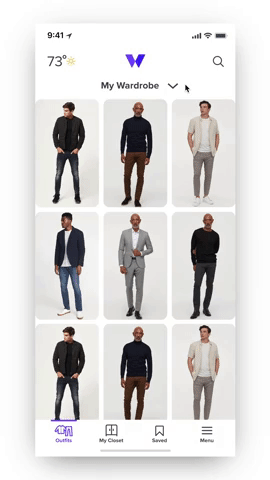
I designed for vertical and lateral scrolling as the main navigation behavior. This allowed content to be laid out in a grid format for quick and easy access by swiping in any direction. Content is the priority and minimalist design details are leveraged. Smart use of negative space, rounded corners and a simple color palette help to define the aesthetic.
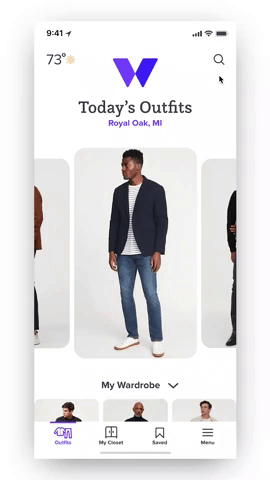
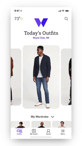
Dashboard Design
The dashboard screen is a hub of information for the user offering daily outfit solutions based on location, weather, season, style preferences and day of the week. Every clothing item and outfit is tagged and offers solutions based on that item or outfit. The system is continuously offering up solutions when the user scrolls and clicks around.

Onboarding
Red Route 1
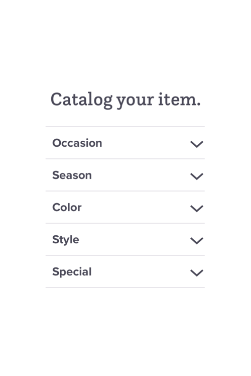
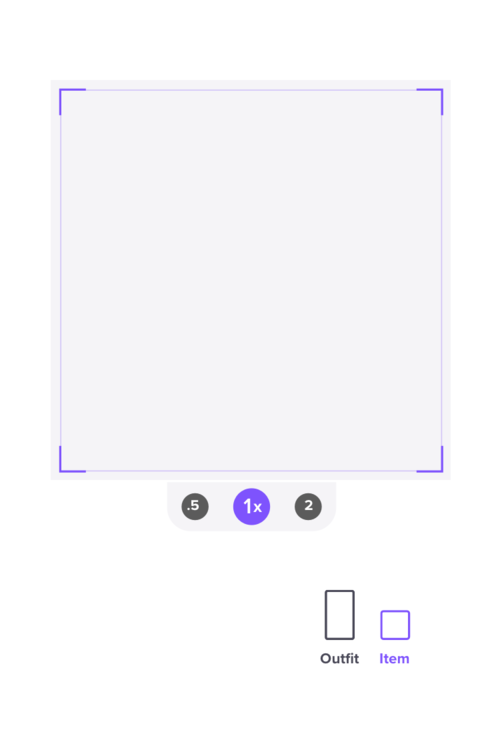
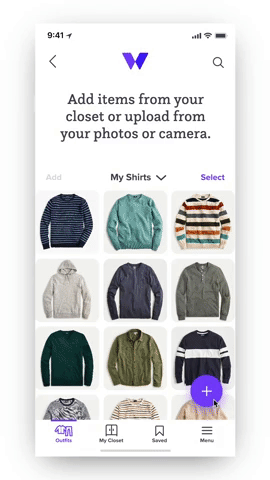
Catalog Clothing
Red Route 2
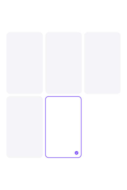
Assemble Outfits
Red Route 3
Prototype 7
Motion Design
Testing
Prototyping
Building the first prototype helped to identify a handful of issues that needed to be resolved. This process helped to discover so many little details that were missing.
Usability Testing
I tested my prototype with five different users. This first round of testing proved to be imperative as a critical usability issue was identified. A few other major and minor issues were also identified.
Design Iterations
A major portion of the app needed to be redesigned as a result of the first round of testing. User expectations for more automated functionality needed to be implemented. As a result, the onboarding process was revised to include a wardrobe setup function thereby eliminating manual uploads throughout the product for a much more streamlined experience. There were also a few design additions that helped minimize cognitive load throughout the product.
Usability Testing Round 2
The iterations were proved to be effective in this round of testing. The elimination of manual uploads for outfits allowed the user to search and explore outfits freely and their expectations were now met. The additional time spent onboarding did not affect the user’s experience negatively.